See also jimmygu3's Chart: Low, Mid & High Housing Bubble Indices
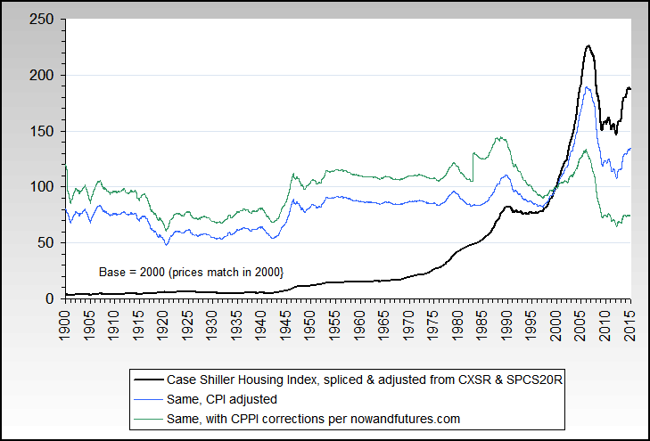
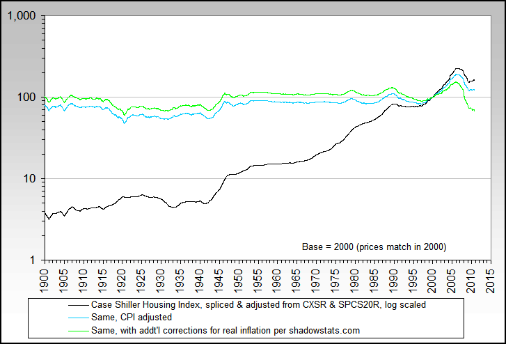
Long-term national nominal Case-Shiller chart back to 1900, currently through Q4 2008. The index has dropped 26.74% since peaking in Q2 2006.

Long-term national Case-Shiller adjusted by official CPI inflation. The CPI-adjusted index has dropped 30.34% since peaking in Q4 2005.

Case-Shiller tracks 20 cities (originally there were only 10) plus a composite of 10 and a composite of 20. The cities are Atlanta, Boston, Chicago, Charlotte, Cleveland, Dallas, Las Vegas, Los Angeles, Miami, Minneapolis, New York, Phoenix, Portland OR, San Diego, San Francisco, Seattle, Tampa, and Washington D.C. Current data is through December 2008.
This chart shows the maximum percentage gain from January 2000 (in yellow) and the current percentage gain (in orange), plus on the right-hand scale, how many months have passed since the peak (in green). Note that Detroit is already well below where they were in 2000.

This similar chart shows the maximum and current percentage drop from the peak. As of December 2008 the two numbers are the same in each market but sometimes the current number recovers somewhat.

For seventeen of the cities, Case-Shiller breaks down the data into three tiers: low-end, mid, and high-end homes. The breakpoints are different for each market and change slightly month-to-month.
This chart shows the maximum percentage gains for each tier of each city from January 2000. The low-end gained the most in every market except Atlanta and Denver.

This similar chart shows the maximum percentage drop for the tiers. The low-end has dropped the most, usually significantly so, in every market except Portland.

Long-term national nominal Case-Shiller chart back to 1900, currently through Q4 2008. The index has dropped 26.74% since peaking in Q2 2006.

Long-term national Case-Shiller adjusted by official CPI inflation. The CPI-adjusted index has dropped 30.34% since peaking in Q4 2005.

Case-Shiller tracks 20 cities (originally there were only 10) plus a composite of 10 and a composite of 20. The cities are Atlanta, Boston, Chicago, Charlotte, Cleveland, Dallas, Las Vegas, Los Angeles, Miami, Minneapolis, New York, Phoenix, Portland OR, San Diego, San Francisco, Seattle, Tampa, and Washington D.C. Current data is through December 2008.
This chart shows the maximum percentage gain from January 2000 (in yellow) and the current percentage gain (in orange), plus on the right-hand scale, how many months have passed since the peak (in green). Note that Detroit is already well below where they were in 2000.

This similar chart shows the maximum and current percentage drop from the peak. As of December 2008 the two numbers are the same in each market but sometimes the current number recovers somewhat.

For seventeen of the cities, Case-Shiller breaks down the data into three tiers: low-end, mid, and high-end homes. The breakpoints are different for each market and change slightly month-to-month.
This chart shows the maximum percentage gains for each tier of each city from January 2000. The low-end gained the most in every market except Atlanta and Denver.

This similar chart shows the maximum percentage drop for the tiers. The low-end has dropped the most, usually significantly so, in every market except Portland.


 ) version of the Credit Suisse chart


Comment