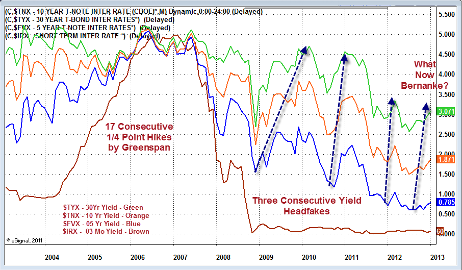
Announcement

Collapse
No announcement yet.

Daily Graphs & Charts

Collapse
X
 
  • Filter
  • Time
  • Show
Clear All
new posts

  • #16
    Re: treasury yields

    True, but you're not accounting for risk in that analysis. There is a reason why the spreads are high right now. If the banks could risklessly arbitrage that gap back down, it by definition wouldn't be there.
    "It's not the end of the world, but you can see it from here." - Deus Ex HR

    Comment


    • #17
      Re: treasury yields

      Originally posted by NCR85 View Post
      True, but you're not accounting for risk in that analysis. There is a reason why the spreads are high right now. If the banks could risklessly arbitrage that gap back down, it by definition wouldn't be there.
      If I had a better grasp of the fundamentals, I would have broken this out as a separate post. None the less, I think you have a misapprehension about the way the interest rate markets work. You seem to think that commercial banks working together somehow force interest rates up or down, or close or open spreads. I'm pretty sure that doesn't happen. Instead, the Fed sets rate targets and the primary dealers are forced to buy at the established rates. The rate structure looks the way it does as a result of more or less out-in-the-open manipulation. This is, as far as I know, not being debated.

      Comment


      • #18
        Re: treasury yields

        Well, ok, part of it is just the expectation that rates won't be kept low by the Fed; i.e. the Fed sets part of the rate by engaging in forward guidance (communicating where rates will be taken in the future). But the truth is, banks have no idea what will happen to the rates and failure is more devastating than success is lucrative. So the negative tail of the risk distribution is disproportionally represented.
        "It's not the end of the world, but you can see it from here." - Deus Ex HR

        Comment


        • #19
          Re: Daily Graphs & Charts

          Hah ask and you shall receive ....

          Here is the link.
          http://online.wsj.com/article/SB1000...pinion_LEADTop

          Here again it would be nice if our leaders told the truth instead of distorting it, so the adults (not them) can make a fair decision.


          December 6, 2012, 7:02 p.m. ET
          Peter Schiff: The Fantasy of a 91% Top Income Tax Rate
          By PETER SCHIFF
          Democratic Party leaders, President Obama in particular, are forever telling the country that wealthy Americans are taxed at too low a rate and pay too little in taxes. The need to correct this seeming injustice is framed not simply in terms of fairness. Higher tax rates on the wealthy, we're told, would help balance the budget, allow for more "investment" in America's future and foster better economic growth for all. In support of this claim, like-minded liberal pundits point out that in the 1950s, when America's economic might was at its zenith, the rich faced tax rates as high as 91%.
          More Opinion
          True enough, the top marginal income-tax rate in the 1950s was much higher than today's top rate of 35%—but the share of income paid by the wealthiest Americans has essentially remained flat since then.
          In 1958, the top 3% of taxpayers earned 14.7% of all adjusted gross income and paid 29.2% of all federal income taxes. In 2010, the top 3% earned 27.2% of adjusted gross income and their share of all federal taxes rose proportionally, to 51%.
          So if the top marginal tax rate has fallen to 35% from 91%, how in the world has the tax burden on the wealthy remained roughly the same? Two factors are responsible. Lower- and middle-income workers now bear a significantly lighter burden than in the past. And the confiscatory top marginal rates of the 1950s were essentially symbolic—very few actually paid them. In reality the vast majority of top earners faced lower effective rates than they do today.
          In 1958, an 81% marginal tax rate applied to incomes above $1.08 million, and the 91% rate kicked in at $3.08 million. These figures are in unadjusted 1958 dollars and correspond today to nominal income levels that are at least 10 times higher. That year, according to Internal Revenue Service records, just 236 of the nation's 45.6 million tax filers had any income that was taxed at 81% or higher. (The published IRS data do not reveal how many of these were subject to the 91% rate.)

          In 1958, approximately 28,600 filers (0.06% of all taxpayers) earned the $93,168 or more needed to face marginal rates as high as 30%. These Americans—genuinely wealthy by the standards of the day—paid 5.9% of all income taxes. And now? In 2010, 3.9 million taxpayers (2.75% of all taxpayers) were subjected to rates that were 33% or higher. These Americans—many of whom would hardly call themselves wealthy—reported an adjusted gross income of $209,000 or higher, and they paid 49.7% of all income taxes.
          In contrast, the share of taxes paid by the bottom two-thirds of taxpayers has fallen dramatically over the same period. In 1958, these Americans accounted for 41.3% of adjusted gross income and paid 29% of all federal taxes. By 2010, their share of adjusted gross income had fallen to 22.5%. But their share of taxes paid fell far more dramatically—to 6.7%. The 77% decline represents the single biggest difference in the way the tax burden is shared in this country since the late 1950s.
          The changes came about not so much by movements in rates but by the addition of tax credits for the poor and the elimination of exemptions for the wealthy. In 1958, even the lowest-tier filers, which included everyone making up to $5,000 annually, were subjected to an effective 20% rate. Today, almost half of all tax filers have no income-tax liability whatsoever, and many "taxpayers" actually get a net refund from the government. Those nostalgic for 1950s-era "tax fairness" should bear this in mind.
          The tax code of the 1950s allowed upper-income Americans to take exemptions and deductions that are unheard of today. Tax shelters were widespread, and not just for the superrich. The working wealthy—including doctors, lawyers, business owners and executives—were versed in the art of creating losses to lower their tax exposure.
          For instance, a doctor who earned $50,000 through his medical practice could reduce his taxable income to zero with $50,000 in paper losses or depreciation from property he owned through a real-estate investment partnership. Huge numbers of professionals signed up for all kinds of money-losing schemes. Today, a corresponding doctor earning $500,000 can deduct a maximum of $3,000 from his taxable income, no matter how large the loss.
          Those 1950s gambits lowered tax liabilities but dissuaded individuals from engaging in the more beneficial activities of increasing their incomes and expanding their businesses. As a result, they were a net drag on the economy. When Ronald Reagan finally lowered rates in the 1980s, he did so in exchange for scrapping uneconomical deductions. When business owners stopped trying to figure out how to lose money, the economy boomed.
          It's hard to determine how much otherwise taxable income disappeared through tax shelters in the 1950s. As a result, direct comparisons between the 1950s and now are difficult. However, it is worth noting that from 1958 to 2010, the taxes paid by the top 3% of earners, as a percentage of total personal income (which can't be reduced by shelters), increased to 3.96% from 2.72%, while the percentage paid by the bottom two-thirds of filers fell to 0.51% in 2010 from 2.7%. This starker division of relative tax burdens can be explained by the inability of upper-income groups to shelter income.
          It is a testament to the shallow nature of the national economic conversation that higher tax rates can be justified by reference to a fantasy—a 91% marginal rate that hardly any top earners paid.
          In reality, tax policies that diminish the incentives and capacities of innovators, business owners and investors will not spur economic improvement. Such policies will, however, satisfy the instincts of those who want to "stick it to the rich." Never mind that the rich have already been stuck fairly well.

          Comment


          • #20
            Re: Daily Graphs & Charts


            That makes the 70s look like not such a big deal.

            Notice high inflation during world war 2. This is often omitted in explanations as to how the great depression was ended. It wasn't just government spending: it also involved inflation.

            Even the deflation of the 30s looks diminutive in historical context!


            http://krugman.blogs.nytimes.com/201...of-the-robots/

            omg, the robots are taking over.

            In non-farming the break from the trend is more recent:


            http://krugman.blogs.nytimes.com/201...onopoly-power/


            http://www.businessinsider.com/goldm...-banks-2012-12

            Looks tradable to me. Only problem is that if the banking system collapses the line goes to infinity.


            http://www.ritholtz.com/blog/2012/12...at-employment/

            Two interesting ones from the recent jobs report.
            "It's not the end of the world, but you can see it from here." - Deus Ex HR

            Comment


            • #21
              Re: Daily Graphs & Charts


              inflation is getting low. We are near a deflation scare. This has historically been a driver for higher gold prices.

              Comment


              • #22
                Re: Daily Graphs & Charts

                2 year inflation expectations (spread between TIPS and regular treasuries) are also still quite low despite QE3 and QE4 just having been initiated. Quite a worrying sign in regard to the effects of the fiscal cliff and likely an indication that further monetary easing is in the cards.

                http://www.bloomberg.com/quote/USGGBE02:IND

                As my earlier graph shows, though, 5 year inflation expectations are still around 2%.
                "It's not the end of the world, but you can see it from here." - Deus Ex HR

                Comment


                • #23
                  Re: Daily Graphs & Charts

                  Originally posted by NCR85 View Post
                  2 year inflation expectations (spread between TIPS and regular treasuries) are also still quite low despite QE3 and QE4 just having been initiated. Quite a worrying sign in regard to the effects of the fiscal cliff and likely an indication that further monetary easing is in the cards.

                  http://www.bloomberg.com/quote/USGGBE02:IND

                  As my earlier graph shows, though, 5 year inflation expectations are still around 2%.
                  Can you tell me how the 5 year tips spread was calculated?
                  Thanks,
                  -G

                  Comment


                  • #24
                    Re: Daily Graphs & Charts

                    the PPI doesn't show anything recent. the best I can do for short term is oil prices.

                    note that oil is zero now.

                    It looks to me like oil is a leading indicator

                    Comment


                    • #25
                      Re: Daily Graphs & Charts

                      Originally posted by globaleconomicollaps View Post
                      Can you tell me how the 5 year tips spread was calculated?
                      Thanks,
                      -G
                      I haven't looked into it extensively but for maturities for which both TIPS and treasury bonds exist, they just subtract the treasury yield from the TIPS yield. For those that TIPS don't exist for they probably look at what TIPS sold x years after being issued are being sold for on the secondary market. For example, a 5 year TIPS sold 3 years after being issued is equivalent to a 2 TIPS. They may well involve that in the calculation for maturities at which TIPS are issued as well.

                      Wikipedia tells me TIPS are sold in 5, 10 and 30 year maturities.
                      "It's not the end of the world, but you can see it from here." - Deus Ex HR

                      Comment


                      • #26
                        the Bernanke Yield Curve

                        Comment


                        • #27
                          Re: the Bernanke Yield Curve

                          What is this showing? I'm not getting it.

                          Comment


                          • #28
                            Re: the Bernanke Yield Curve

                            I think Mr. Don is trying to say that there have been three other times when yields have been creeping up, only to fall dramatically.
                            We are in time #4, with the 10yr going from 1.4% on 7/24, to 1.91% just the other day That is about a 30% up in rates. Will this be the top and we will see even a lower interest rate regime, initiated by some new fed program? Say 20-30% less than 1.4%? Typical play out time is 6mo to 1 year. So 1.2-1.1% 10 yr rates in July???

                            Comment


                            • #29
                              Re: the Bernanke Yield Curve

                              Originally posted by charliebrown View Post
                              I think Mr. Don is trying to say that there have been three other times when yields have been creeping up, only to fall dramatically.
                              We are in time #4, with the 10yr going from 1.4% on 7/24, to 1.91% just the other day That is about a 30% up in rates. Will this be the top and we will see even a lower interest rate regime, initiated by some new fed program? Say 20-30% less than 1.4%? Typical play out time is 6mo to 1 year. So 1.2-1.1% 10 yr rates in July???
                              +1

                              Comment


                              • #30
                                Re: the Bernanke Yield Curve

                                Originally posted by charliebrown View Post
                                I think Mr. Don is trying to say that there have been three other times when yields have been creeping up, only to fall dramatically.
                                We are in time #4, with the 10yr going from 1.4% on 7/24, to 1.91% just the other day That is about a 30% up in rates. Will this be the top and we will see even a lower interest rate regime, initiated by some new fed program? Say 20-30% less than 1.4%? Typical play out time is 6mo to 1 year. So 1.2-1.1% 10 yr rates in July???
                                The yield curve looks a good deal like previous cycles to my uneducated eye. I'm going to contradict the chart I put up above as a kind of devil's advocate kind of thing:


                                That looks like a yield curve inversion in 2013-2014. This is frequently associated with a recession.

                                Comment

                                Working...
                                X