Announcement

Collapse
No announcement yet.

Chart comparing the 2000-2003 bear to now

Collapse
X
 
  • Filter
  • Time
  • Show
Clear All
new posts

  • Chart comparing the 2000-2003 bear to now

    for those wanting to compare top tick to top tick, instead of from ej's call:


    http://jessescrossroadscafe.blogspot.com/

  • #2
    Re: chart comparing the 2000-2003 bear to now

    JK -

    Bearish follow through on this comparison is not yet "in the bag".

    bear-1.jpg

    Comment


    • #3
      Re: chart comparing the 2000-2003 bear to now

      Originally posted by jk View Post
      for those wanting to compare top tick to top tick, instead of from ej's call:


      http://jessescrossroadscafe.blogspot.com/
      Great chart. Did Jesse make a end of 2007 bear market call?
      Ed.

      Comment


      • #4
        Re: chart comparing the 2000-2003 bear to now

        Originally posted by FRED View Post
        Great chart. Did Jesse make a end of 2007 bear market call?
        what is your problem? why can't a chart be just a chart? why can't someone want to look at a chart drawn from a different start date than your own without triggering this hypercompetitive, self-promotional response? sheesh!:rolleyes: you don't have anything to prove around here. what isn't already self-evident to any reader here is not worth emphasizing.

        Comment


        • #5
          Re: chart comparing the 2000-2003 bear to now

          Originally posted by jk View Post
          what is your problem? why can't a chart be just a chart? why can't someone want to look at a chart drawn from a different start date than your own without triggering this hypercompetitive, self-promotional response? sheesh!:rolleyes: you don't have anything to prove around here. what isn't already self-evident to any reader here is not worth emphasizing.
          What, are you guys all trying to drive me crazy! :eek:

          Seriously, here's the issue. You say:

          for those wanting to compare top tick to top tick, instead of from ej's call:
          Here is the iTulip Debt Deflation Bear Market (DDBM) Chart:


          You are comparing Jesse's 2001- 2002 bear market chart to iTulip's DDBM chart, right? But to compare them is misleading in a critically important way. Here's why.

          Go back 10 years and you will find one similar to Jesse's posted on iTulip Feb. 19, 1999:


          Then we were comparing like processes: stock market crashes in 1987 and 1929. Today we are comparing the Japan DDBM 1990 to date with the US DDMB 2008 to who knows when. Jesse on the other hand is comparing a stock bubble crash bear market to a debt deflation bear market: apples and oranges.

          The reason this matters is that if you do not understand the underlying process driving a market you have no way of knowing how the market is likely to develop. If readers mistook the DDBM as another post stock bubble bear market as Jesse's chart suggests, they'd expect a year or two of declines followed by recovery. We don't want our readers to think that because ten years of research tell us that is not the case. We expect the market to decline for several years and then stay there until all of the structural imbalances that have accumulated in the US economy and financial system are resolved in the political economy.

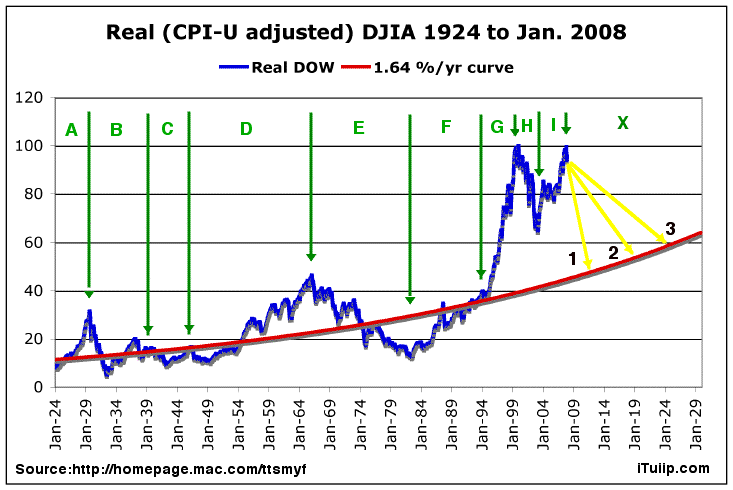
          Here's another take from our Real DOW chart:


          It puts the end of the DDBM between 2012 and 2025, admittedly a very wide target, and we will narrow that over time, but well outside the range implied by Jesse's chart.
          Ed.

          Comment


          • #6
            Re: Chart comparing the 2000-2003 bear to now

            thanks. that's a much more illuminating response. [and let's not forget the likely overshoot.]

            Comment


            • #7
              Re: Chart comparing the 2000-2003 bear to now

              Originally posted by jk View Post
              thanks. that's a much more illuminating response.
              It is. And I had the same reaction JK did when I first saw your post Fred.

              But pointing out why you think it's not a relevant comparison was very helpful. Much more so than just jabbing at the other guy. I'd have never sorted out what you were getting at otherwise.

              Also... I can't read the legend on that chart you dug up from 1999, but I'd sure like to. I didn't realize that the US/Japan 'debt deflation' chart wasn't the first time iTulip had done that sort of comparison.

              Is it iTulip's position that similar types of market movements are correlated across time? Or are those comparisons intended as just one example of how things might play out?

              Comment


              • #8
                Re: chart comparing the 2000-2003 bear to now

                Originally posted by FRED View Post
                Then we were comparing like processes: stock market crashes in 1987 and 1929. Today we are comparing the Japan DDBM 1990 to date with the US DDMB 2008 to who knows when. Jesse on the other hand is comparing a stock bubble crash bear market to a debt deflation bear market: apples and oranges.

                The reason this matters is that if you do not understand the underlying process driving a market you have no way of knowing how the market is likely to develop. If readers mistook the DDBM as another post stock bubble bear market as Jesse's chart suggests, they'd expect a year or two of declines followed by recovery. We don't want our readers to think that because ten years of research tell us that is not the case. We expect the market to decline for several years and then stay there until all of the structural imbalances that have accumulated in the US economy and financial system are resolved in the political economy.
                However, if the debt deflation process in the US is accompanied by a rapid devaluation of the currency, would you still expect the Dow to track the Nikkei in nominal terms? And further out, when inflation is firmly enconsced through the (awaited) wage inflation?

                Comment


                • #9
                  Re: chart comparing the 2000-2003 bear to now

                  Originally posted by zmas28 View Post
                  However, if the debt deflation process in the US is accompanied by a rapid devaluation of the currency, would you still expect the Dow to track the Nikkei in nominal terms? And further out, when inflation is firmly enconsced through the (awaited) wage inflation?
                  An excellent point. Even as the DOW deflates the dollar deflates as well while the Fed cuts rates. This is in stark contrast to the Bank of Japan's policy of raising rates for the first nine months of the Japanese debt deflation, perhaps not knowing what it as, as the Nikkei fell 33%. Here at iTulip we try not to concern ourselves with the nominal DOW, leaving that to CNBC reporters and columnists featured on Yahoo! Finance, such as Ben Stein, the leading edge of the Flying Monkeys of the FIRE Economy who sent out to at every crisis to adjust expectations across the land, fanning out from their cages on Wall Street, in well endowed academies in Chicago, and on K Street in Washington, D.C. where they are fed and cared for. Their leader in the person of Henry Paulson follows a long line of ex-bankers cum Treasury secretaries. Recent assurances recall Andrew Mellon who took the role of head of the Treasury in 1921 at the start of a massive, credit fueled post war expansion. Eight years later he was saying:
                  Very Prosperous Year Is Forecast

                  Guenther Analyzes the Report of Mellon Covering 1929

                  That 1930 may be a very prosperous year, industrially and otherwise, without the peak conditions that made 1929 and exceptional year for business prosperity, is an observation made by Louis Guenther, publisher of the Financial World, in a statement based upon Secretary Mellon's fiscal report...

                  "To grow too fast is often unhealthy because of the suddenness with which a readjustment must be met. By far and large the country would be better off were further progress made along more normal lines...

                  Fortunately, we have returned to a more normal mind in appraising prospects. We are not looking for the Midas touch on everything to which we turn. That makes us more satisfied with normal incomes and normal profit returns."

                  - The World, December 15, 1929

                  We apologize for any confusion we may have caused by failing to inflation-adjust our Nikkei vs DOW debt deflation chart and will correct this oversight in our next update so that it is consistent with our Real DOW chart.

                  On the topic of wage inflation, in the words of John Craig, a weakening yuan exports pricing power to US manufacturers, which pricing power feeds back into, among other prices, wage price. This factor competes with the tendency of recessions to raise unemployment and reduce wage earners' pricing power.

                  The outcome of that contest depends on a number of political factors, including tax policy as it impacts outsourcing, immigration policy as it impact job competition, the tendency of immigrants to stay home when jobs are scarce in the US, as GRG points out trade policy disguised as climate policy, and other factors.
                  Ed.

                  Comment

                  Working...
                  X