Announcement

Collapse
No announcement yet.

Azizonomics: Stocks Priced in Real GDP

Collapse
X
 
  • Filter
  • Time
  • Show
Clear All
new posts

  • Azizonomics: Stocks Priced in Real GDP

    Stocks Priced in Real GDP

    March 24, 2013
    Aziz Economics, Finance, Wall Street dow 36000, economy, glassman, hassett, new plateau, real gdp, stocks, wealth effect 17 Comments
    Since the 1990s, priced in Real GDP the Dow Jones Industrial Average (as well as the S&P500) has been far above their 20th-century norm:

    There is an unsurprising coincidence — as stock prices (and corporate profits) have soared above their historical norm, wage growth has been very stagnant. The economy has come to be tilted toward bankers, financiers, insurance brokers and away from wage-earners, manufacturers and artisans.
    Does that mean that as Hassett and Glassman projected in Dow 36,000, stock prices have climbed to a new plateau? Well, while it is impossible to say exactly what prices will do in future (nominal, or otherwise) the “new plateau” has been very much supported by the Federal Reserve, first by lowering rates and keeping them low:

    And second through expanding the monetary base by buying securities directly (Bernanke estimates a simulated interest rate decrease of 0.25% for each 250 billion dollars of quantitative easing):

    Each time stocks have turned cheaper, the Fed has stepped in and eased, and stocks have reversed upward.
    Some might take that as a sign that stocks aren’t going to get much cheaper, because the Fed won’t let them get much cheaper. First under Greenspan, and second under Bernanke the Fed has succeeded at reinflating the bubble. But the secular trend is back toward the pre-1990s norm. Gravity is against the Fed. The Fed (to use a tired old metaphor) is Atlas, holding stock prices up on its shoulders. Will it be third-time unlucky for the Fed, hell-bent on wealth-effecting and financialising the US economy to prosperity?

    Source: http://azizonomics.com/2013/03/24/st...d-in-real-gdp/

    ----

    Some really powerful graphs that clearly show the monetary regime change and asset inflation it engendered since the early 80s.

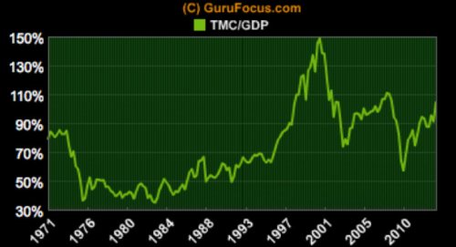
    US total debt began to rise at the same time asset prices diverged from GDP:


    I agree with the author that this is probably mean-reverting, either through another asset market collapse a la 2008, or through mass debt monetization and government deficit spending that sends the CPI higher.
    "It's not the end of the world, but you can see it from here." - Deus Ex HR

  • #2
    Re: Azizonomics: Stocks Priced in Real GDP

    The thing I've always found interesting is that while all this debt was being generated, supposedly boosting the demand expressed in the economy, GDP growth did not rise above the levels seen in the 50s and 60s. It's as if all this monetary "doping" was needed just to keep the system going at the rate is was used to.

    In the 70s something happened that structurally diminished the ability of the US economy to grow. I have an idea as to what the "something" is:


    The halting of the rise of energy consumption around 1970, brought about mainly through the geological fact that US oil extraction was peaking. Now think about what this means: going from a very steep rise to a complete absence of any growth in energy use. That delivers quite a shock to the system.

    You'll notice a similar halting takes place around 1920, which also saw a great growth of asset prices with no fundamental justification for it. The important thing to notice there is that the rise stops during the boom period, not when the bust sets in!
    "It's not the end of the world, but you can see it from here." - Deus Ex HR

    Comment


    • #3
      Re: Azizonomics: Stocks Priced in Real GDP

      Another chart showing a massive divergence from the historical norm in stock prices:


      http://advisorperspectives.com/dshor...ing-and-PE.php
      "It's not the end of the world, but you can see it from here." - Deus Ex HR

      Comment


      • #4
        Re: Azizonomics: Stocks Priced in Real GDP

        I really don't know how rational people could buy stocks at these levels (unless your picking ones that would do well with inflation). I've been wondering though, how high will the dividends be, and how long would they stay at that level if stock prices go back to their pre 1990 norm


        Comment


        • #5
          Re: Azizonomics: Stocks Priced in Real GDP

          Originally posted by verdo View Post
          I really don't know how rational people could buy stocks at these levels
          Didn't you hear? This time is different!

          Comment


          • #6
            Re: Azizonomics: Stocks Priced in Real GDP

            Originally posted by NCR85 View Post
            The thing I've always found interesting is that while all this debt was being generated, supposedly boosting the demand expressed in the economy, GDP growth did not rise above the levels seen in the 50s and 60s. It's as if all this monetary "doping" was needed just to keep the system going at the rate is was used to.

            In the 70s something happened that structurally diminished the ability of the US economy to grow. I have an idea as to what the "something" is:


            The halting of the rise of energy consumption around 1970, brought about mainly through the geological fact that US oil extraction was peaking. Now think about what this means: going from a very steep rise to a complete absence of any growth in energy use. That delivers quite a shock to the system.

            You'll notice a similar halting takes place around 1920, which also saw a great growth of asset prices with no fundamental justification for it. The important thing to notice there is that the rise stops during the boom period, not when the bust sets in!
            I see quite a difference between the 1920 to 1940 period of Roaring Twenties credit boom followed by post-stock market decline Great Depression bust, and the 1980 to 2008 credit boom and post-stock market decline bust. During the former, as you noted, per-capita energy consumption declined during the decade of the boom, and kept declining through the bust. In the latter case it increased during the entire time of the credit boom and only turned after the bubblicious markets turned in early 2000...

            Comment


            • #7
              Re: Azizonomics: Stocks Priced in Real GDP

              Originally posted by GRG55 View Post
              I see quite a difference between the 1920 to 1940 period of Roaring Twenties credit boom followed by post-stock market decline Great Depression bust, and the 1980 to 2008 credit boom and post-stock market decline bust. During the former, as you noted, per-capita energy consumption declined during the decade of the boom, and kept declining through the bust. In the latter case it increased during the entire time of the credit boom and only turned after the bubblicious markets turned in early 2000...
              Could it be that in the 20's, the excess credit funded more productive investment, ie. malinvestment, which resulted in over-capacity and glut, as opposed to the latter period's consumer-credit based consumption, which produced much less in the form of cash flow producing productive assets (at least, in the USA), while producing gluttons, but little residual productive wealth?
              Whew! That was a truly awful sentence. Where is my Hegelian writing guide???

              Comment


              • #8
                Re: Azizonomics: Stocks Priced in Real GDP

                Excellent observations, NCR85!


                Last edited by jabberwocky; March 26, 2013, 01:12 PM.

                Comment


                • #9
                  Re: Azizonomics: Stocks Priced in Real GDP

                  Originally posted by GRG55
                  In the latter case it increased during the entire time of the credit boom and only turned after the bubblicious markets turned in early 2000...


                  I don't think you're reading the graph right. The rise of energy use stops around 1970. The boom in total credit started in +/- 1980. The period from 1970 to 1980 was mainly plagued by high inflation, which is also not exactly a sign of economic health. So it was in fact at the start of the inflationary boom (first in the whole economy, then in a more masked way only in assets and the credit market) that energy consumption stopped rising.
                  "It's not the end of the world, but you can see it from here." - Deus Ex HR

                  Comment


                  • #10
                    Re: Azizonomics: Stocks Priced in Real GDP


                    This is Warren Buffett's favorite stock market valuation metric: total market capitalization as a proportion of GDP. It shows the same pattern of a wild upward divergence from the norm in stock prices in +/- the 1990s.

                    The article this was in (which is highly recommended reading afaic) links the ratio to an implied total return forecast for the stock market based on the historical empirical data:

                    1. A terminal ratio of 120 percent (equivalent to the 1999 to 2001 period) leads to annualized nominal returns of 8.1 percent over the next 10 years.
                    2. A terminal ratio of 80 percent (the long-run average) leads to annualized nominal returns of 3 percent over the next 10 years.
                    3. A terminal ratio of 40 percent (approximating the 1982 low of 35 percent) leads to annualized nominal returns of -5 percent over the next 10 years.
                    http://www.gurufocus.com/news/214210...e-stock-market

                    Personally I think it's most realistic to expect for the ratio to go somewhere between the historical average of 80% and it's average EXCLUDING the post-90s bubble years (probably somewhere closer to 60%), so let's say 70%. But I wouldn't be surprised at all if it went all the way to 60% or overshot even that to the downside.
                    Last edited by NCR85; March 26, 2013, 06:23 PM.
                    "It's not the end of the world, but you can see it from here." - Deus Ex HR

                    Comment


                    • #11
                      Re: Azizonomics: Stocks Priced in Real GDP

                      I don't think you're reading the graph right. The rise of energy use stops around 1970. The boom in total credit started in +/- 1980. The period from 1970 to 1980 was mainly plagued by high inflation, which is also not exactly a sign of economic health. So it was in fact at the start of the inflationary boom (first in the whole econ...............
                      I am not sure that this is the best place to insert this, but..................

                      An oil-price spike is often used as the textbook example of a supply shock. However, rapidly rising oil prices can also reflect a demand shock. Recognizing the difference is important for central bankers. A supply-driven increase in the price of oil can result in higher unemployment and inflation, leaving central bankers with the difficult decision to loosen policy, tighten policy, or not respond at all. A demand-driven increase reflecting global growth may support the case for tighter policy. In this post, we describe an approach for decomposing oil price changes into supply and demand shocks using financial market data.
                      Financial Markets and Oil-Price Shocks
                      While it’s not possible to measure supply and demand shocks directly, we identify them by looking at their impact on financial prices. For example, when the price of oil goes up, then equity markets of oil exporters and the prices of oil stocks tend to rise compared to other countries or sectors, regardless of the type of shock. However, if supply constraints are raising prices, then the currencies and equity markets of oil importers usually decline, accompanied by the underperformance of cyclical stocks and outperformance of defensive stocks relative to the overall equity market. Conversely, if global aggregate demand pushes up the price of oil, then we typically see the opposite patterns, accompanied by higher interest rates and the depreciation of safe-haven currencies. Other commodity prices tend to be positively correlated with the price of oil, although the strength of this correlation is weaker in the case of an oil supply shock than in the case of a demand shock. Finally, the net number of long positions (those buying the right to receive oil in the future minus those promising to deliver) of noncommercial oil traders (those not associated with firms processing oil) is slightly more positively correlated with the price of oil during a supply shock than during a demand shock.
                      We can also consider the effect on oil prices from the risk of future supply constraints or the expectation of future economic growth. For example, supply concerns about Iran’s nuclear program probably contributed to higher prices even before the United States and the European Union imposed an oil embargo. Similarly, volatility in the price of oil during the Great Recession was attributed to rapidly changing expectations about demand.
                      Decomposing Oil-Price Changes Related to Supply and Demand
                      Partial least squares (PLS) is a technique we use to construct linear combinations of the variables in our financial market data set—called factors—which have maximum explanatory content for oil-price changes. We first use this procedure to generate factors that best capture the patterns in the data, and then examine the estimated factors to determine if they resemble a demand or supply shock. Using data from 1995 onwards, we extract the factors from monthly oil-price changes and seventy-four time series in the categories listed in the table below.


                      The order of the factors reflects how well they fit the data. We want to use a few factors to explain most of the variation in the data. The results from regressing these factors on oil-price changes reveal that the first two factors can explain 65 percent of the variation (R-squared), with the first four explaining 81 percent (see chart below). Additional factors didn’t increase explanatory power notably.


                      The four factors are identified as two demand and two supply shocks, with the identification achieved in three stages. First, we examine the correlations of the factors with our data to see if they match the expected patterns. Second, we check the factors against other measures that are likely related to supply or demand shocks. Third, we compare the factors with an oil-price decomposition constructed by other researchers using a different technique.
                      The table summarizes pair-wise correlations between the factors and the underlying data series. In the case of the first and second factors, the observed direction of the correlations closely matches the earlier described expected pattern for a demand and supply shock (reflected in the table by the light green shading). The third and fourth factors show a less clear match, with either weak or mixed correlations (reflected by the “o” marks) within the categories or correlations inconsistent with the identified shock (reflected by the dark red shading).
                      We check our interpretation by running regressions between the factors and several indicators related to global economic growth, oil-market supply, and global risk perception. Our demand factors are significantly related to the OECD leading indicators for the G-7 countries and China. The second factor—the main supply factor—is significantly related to reported OPEC spare capacity and the Economic Intelligence Unit’s political risk indices for Middle East and Northern African countries (weighted by their oil production). Finally, both supply factors are negatively correlated with VIX S&P 500 option volatility, often called the “fear index,” fitting the notion that a supply shock is bad news for the global economy.
                      We also confirm our interpretation by comparing our decomposition with that in a paper by Juvenal and Petrella (2011). Our demand factors together show a pattern similar to the oil-price history the authors attribute to “global demand” (see left chart below). Furthermore, our supply factors match much of the oil-price changes they identify as arising from “global supply,” “inventory,” or “speculative” forces (see right chart).


                      A Brief Supply-Demand History of Oil Prices
                      Our decomposition of the price of oil is shown in the next chart, which represents cumulative changes since January 1995, not the actual level of the price of oil. The estimated changes fit the actual changes well. The decomposition also matches conventional interpretations of conditions in the oil market. The 1990s were generally seen as a period of excess oil supply. The next decade shows a rise in global demand, eventually reaching the limits of supply in 2007. Prices then fell dramatically, as demand declined due to the global contraction during the financial crisis and consequently supply became less constrained. Demand again increased during the global recovery. Supply pressures re-emerged, with both feared and actual supply disruptions around the “Arab Spring,” especially with the shutdown of Libyan production and increased tension regarding Iran’s nuclear program. Since that time, Iran’s oil exports have been embargoed, while Libyan production has returned to near-normal levels; Iraqi production has increased meaningfully, and Saudi Arabia has kept its production elevated, serving to temper the effect of supply constraints on oil prices.


                      In conclusion, our analysis helps identify the 1990s as a period of excess supply in the oil market, and the 2000-09 period as one in which demand factors were dominant. More recently, supply pressures appeared again as major oil-price determinant.

                      Comment


                      • #12
                        Re: Azizonomics: Stocks Priced in Real GDP


                        http://www.mebanefaber.com/2013/03/2...nd-valuations/

                        Just came across this graph, which says the historical average for total market cap / GDP is in fact +/- 60%. I already thought the 80% figure that the other article claimed seemed a little on the high side.

                        If the ratio returns to the historical mean, total nominal returns, including dividends, over the next 10 years should be negative!!

                        The historical mean for the period prior to the bubble years is even lower than 60%! (45 ish by my estimation)

                        If Buffett still likes this metric so much he should be a big, fat, hairy bear at this stage.
                        "It's not the end of the world, but you can see it from here." - Deus Ex HR

                        Comment

                        Working...
                        X