Announcement
Collapse
No announcement yet.
anyone else read ej's twits?
Collapse
X
-
Re: anyone else read ej's twits?
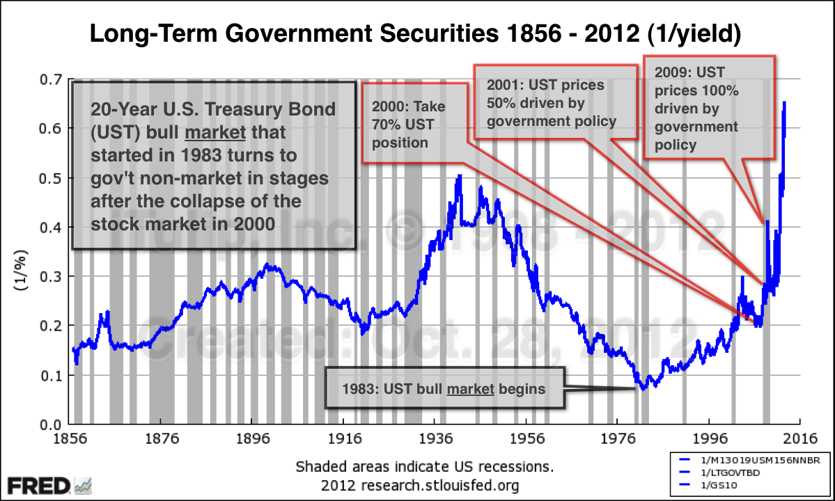
What do those percentages "driven by government policy" mean, exactly? Are they based on some form of quantified data or just an estimation? If the former, what data would that be?"It's not the end of the world, but you can see it from here." - Deus Ex HR
Comment
-
Re: anyone else read ej's twits?
I'm not sure if I'm interpreting this chart correctly. Is it projcting a huge rise in the value (as opposed to the yield) of US goverment bonds in the coming years? Does this suggest sustained deflation over this period?Originally posted by metalman View Post
Comment
-
Re: anyone else read ej's twits?
I thought it displayed what had already happened at first, since treasury yield are at a historically extreme low. But they don't seem to have gone down by quite as much as that chart implies (1/0.66 = 1.5%; so far 2.5% has been lowest)."It's not the end of the world, but you can see it from here." - Deus Ex HR
Comment
-
Re: anyone else read ej's twits?
This tweet was premature. As part of the new iTulip.com we use Twitter to announce the availability of new articles on iTulip. The article is scheduled to appear before the election.Originally posted by Dave Stratman View PostI'm not sure if I'm interpreting this chart correctly. Is it projcting a huge rise in the value (as opposed to the yield) of US goverment bonds in the coming years? Does this suggest sustained deflation over this period?
On the chart, you cannot derive a price of a bond from the yield but by dividing 1 by the yield you can see relative changes in bond prices over time.
The chart shows the relative price of long-term U.S. Treasury bonds from January 1856 to September 2012. The chart tells us two things:
1. UST bonds have never been more expensive since the 1850s.
2. UST bond prices have never before risen so quickly.
The chart brings into sharper focus the danger that the UST market faces.
Comment
-
Re: anyone else read ej's twits?
Corrected.Originally posted by Southernguy View Post"1. UST bonds have never been cheaper since the 1850s."
If I understand correctly, should read "UST bonds have never been more expensive since the 1850s."
Could this be translated also as: "cash has never been so cheap since...."?
Shown this way we can see the extreme artificial rise in bond prices that has been caused by the Fed and Treasury's policy of creating artificial demand.
Comment
-
Re: anyone else read ej's twits?
What do you mean by "Artificial demand"? By who? Fed and banks, OK, but China, Japan ?Originally posted by EJ View Post
Shown this way we can see the extreme artificial rise in bond prices that has been caused by the Fed and Treasury's policy of creating artificial demand.
What gov policies other than ZIRP and QE account for the effect on the UST prices? 100% seems a bit much?
Comment
-
Re: anyone else read ej's twits?
The Fed doesn't have to buy all of the UST issuance for the UST market to be 100% government controlled. It can use its "infinite" balance sheet to intimidate bond buyers into accepting interest rates that fail to reflect market-based pricing of default and inflation risk. No one dares to try bid up interest rates or bid down prices. Everyone who has tried over the past three years has gotten killed.Originally posted by vinoveri View PostWhat do you mean by "Artificial demand"? By who? Fed and banks, OK, but China, Japan ?
What gov policies other than ZIRP and QE account for the effect on the UST prices? 100% seems a bit much?

Comment
-
Re: anyone else read ej's twits?
which begs the question: why can't it go on "forever"?Originally posted by EJ View PostThe Fed doesn't have to buy all of the UST issuance for the UST market to be 100% government controlled. It can use its "infinite" balance sheet to intimidate bond buyers into accepting interest rates that fail to reflect market-based pricing of default and inflation risk. No one dares to try bid up interest rates or bid down prices. Everyone who has tried over the past three years has gotten killed.

Comment
-
Re: anyone else read ej's twits?
eventually international demand for the Dollar dries up due to bilateral trade agreements that bypass the Dollar, especially if there are internal issues in some of those countries related to war or energy resource scarcity. (I think on Financial Sense EJ mentioned that the US could have issues with China or Japan if drawn into some sort of engagement between them).Originally posted by vinoveri View Postwhich begs the question: why can't it go on "forever"?
eventually the negative returns destroy pension funds & insurance companies. that in turn destroys some people's lives & the general trust in the financial system + economy. greater friction then acts as a drag on GDP growth, making funding ongoing obligations that much harder.
once inflation rises above some point the gap becomes large enough that people find ways to opt out, as eventually they lose credibility.
Comment
-
-
Re: anyone else read ej's twits?
Is it possible to plot the bond price and is this info on line somewhere?Originally posted by EJ View PostThis tweet was premature. As part of the new iTulip.com we use Twitter to announce the availability of new articles on iTulip. The article is scheduled to appear before the election.
On the chart, you cannot derive a price of a bond from the yield but by dividing 1 by the yield you can see relative changes in bond prices over time.
The chart shows the relative price of long-term U.S. Treasury bonds from January 1856 to September 2012. The chart tells us two things:
1. UST bonds have never been more expensive since the 1850s.
2. UST bond prices have never before risen so quickly.
The chart brings into sharper focus the danger that the UST market faces.
Comment
-
Re: anyone else read ej's twits?
Investopedia does a great job explaining bonds. This section deals with bond pricing. Recommend all of the articles in the series.Originally posted by globaleconomicollaps View PostIs it possible to plot the bond price and is this info on line somewhere?
As far as plotting bond prices, you can calculate the price of a bond and plot how the price changes with changes in interest rates.
But the plot that I have done is typically done to invert an index to see the inverse of the index. Inverting yields does not produce a price curve but it does reveal the extreme price level of the bond market overall.
Comment

Comment