 Tweet
Tweet
A question that seems to come up over and over again is how it is possible for the nation to bailout the banking industry with trillions of dollars and for the Federal Reserve to enter into programs like quantitative easing without inflation showing up in the headline figures. The issue of course is how the Bureau of Labor and Statistics measures the housing component in the Consumer Price Index (CPI). Housing is the largest item in the CPI basket yet during the raging housing bubble the home price measure did not show any signs of a bubble. In fact in the peak bubble years of 2004 through 2007 the CPI measure of housing only registered a 4 percent year-over-year change. We can measure this against the Case-Shiller Index that was measuring annual price changes across the United States above 15 percent. Can it be that the crashing housing market is underscoring the rising cost of goods in other sectors of the economy because of the heavy weighting of housing in the CPI? That is what we will explore today.
In order to understand how inflation is measured by the BLS we first need to look at the basket of goods used on a monthly basis and their associated weighting in the basket:
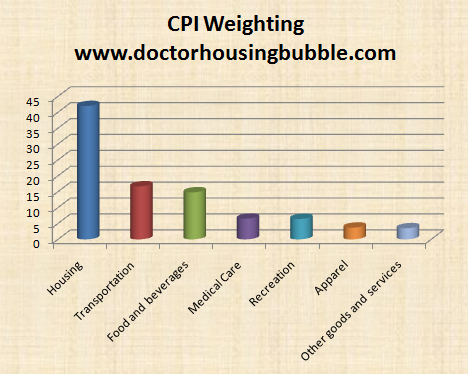
Source: BLS
It is rather apparent that housing consumes the largest portion of the basket since housing costs are typically the largest outlay for most Americans. The CPI gives housing the following weight:
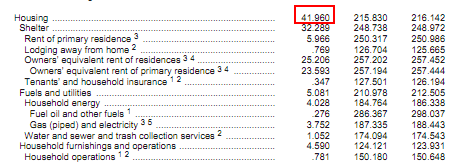
Close to 42 percent of the monthly basket is associated to housing costs including utilities. Yet the reason the CPI missed the entire housing bubble is because of how it looks at housing costs. More importantly, it uses an �owners� equivalent of rent� for the largest component of the CPI. What this does is basically underplays the actual cost of the home. For example, say your Culver City home would rent for $2,500 but your actual carrying cost is $4,000 then the OER is shown as $2,500. Clearly this underplayed the rising bubble in housing and we see this in the CPI housing component:
[cpi housing]
Notice that in the peak years of the bubble it was registering annual gains in housing of slightly above 4 percent. Yet the reality on the ground was much more severe as anyone that followed the housing market closely or just happened to live in a bubble state like California. Nationwide home prices were rising much faster than the CPI figure:
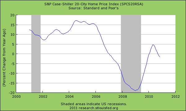
The Case-Shiller was registering annual gains of 15 percent and higher during the peak years of the bubble. The Federal Reserve was well aware of the bubble but kept using the CPI and referencing it as a reason for keeping rates artificially low during the bubble. What is interesting about the two charts above is that it also shows that the CPI component has corrected only modestly in regards to housing costs while the Case-Shiller metric plummeted accurately to reflect crashing home values. In other words the CPI which is designed to measure the cost of spending for Americans largely missed the biggest line item by a giant margin. Yet nothing has changed to reflect this new reality but now, the declining values of housing are hiding changes in other sectors of the economy. Just like the CPI missed the housing bubble it is missing the run-up in other sectors.
Take a look at some of the areas of the CPI broken out by sector:
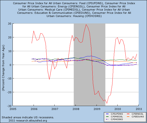
You can see the dramatic and seasonal change in energy measured by the red line. Yet housing since early 2009 has been negative for the CPI yet every other sector including food, energy, medical care, and education has been solidly above the 0 percent line. Housing being the largest component is making the entire basket look as if price growth isn�t occurring. Couple this with stagnant wages and persistently high unemployment and you can understand why it is unlikely home values will be going up anytime soon. This also doesn�t reflect the larger changes of the nation because many people have switched to renting or doubling up out of economic necessity. Lower wages or no jobs equates to less housing demand. Large vacancy rates have held rents stagnant or have dropped them in some markets. So the decline in housing values is hiding the costs of daily goods rising. Take for example the cost of a gallon of gas:
US gas prices are now trending strongly up. Here in Southern California I have seen premium going for $3.80 and we are only entering the time of year when gas goes up even higher and with global uncertainty this is likely to continue. The above graph shows that gas peaked above $4 nationally and fell to below $2 after the massive run-up in 2008. But today it is now over $3. This is a 50 percent increase from the recent trough for a good that is used weekly by all. If you only look at the CPI you would think nothing has changed. Food costs have been going up but manufactures have done a good job hiding inflation by lowering the quantity they give you for the same price:

Source: CNN
I thought I was losing my mind when my box of cereal didn�t last as long. Another important thing to mention is the tiny weighting given to medical care which is going to be a large cost for many baby boomers. Why would this weighting be so little if the demographics of the nation will be shifting to this being a large line item of consumption for many? Keep in mind many will rely on Medicare later in life so the money doesn�t necessarily come out of their pocket but someone is paying for this. Just like housing, this inflation is hidden. This is similar to the massive subsidy that is given to the housing market via artificially low rates or large tax credits via mortgage deduction. Why not cap the mortgage deduction at the median price of nationwide housing? Another item that impacts a younger generation is the incredible price rises in education. Take for example the cost of education for a public university in California:
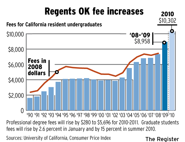
Since income hasn�t gone up in the last decade and state funding is dwindling to institutions of higher education many more students are going to go into deeper debt for a college degree. The weighting for education is tiny on the CPI measure yet if you go to school and come out with $50,000 in debt and your first job pays you $40,000 a year, the cost of your education is going to eat a large portion of your income. You may be paying $600 in rent and $300 in repaying your debt.
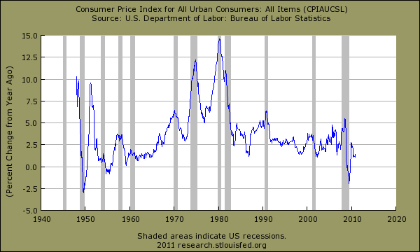
Some will argue that the CPI is merely a reflection of all goods in the economy and over time offers a good measure of consumer inflation. So far for the last decade it has been a very poor measure because of the way housing is measured and its heavy weighting. The Federal Reserve will point to the CPI in support of bailing out the banks and quantitative easing. They have a point when you look at the overall basket:
Yet there is a big caveat here. Price inflation is happening ex-housing. In the early years of the bubble I argued that using the CPI to argue against a housing bubble was na�ve because it was understating the true cost of owning a home. The OER measure understated the true carrying cost of owning a home. NINJA loans allowed people with no income to buy homes that had a carrying cost of $3,000 per month! You can�t even measure that kind of weighting. Even worse, you had many folks that over leveraged and had housing eating up 70, 80, and even 90 percent of their take home pay. That is no longer the case but we are using the same CPI measure today with no adjustments.
If the main purpose of the CPI is to get a sense of the impact and feel of consumption for most Americans and it missed the entire housing bubble, then you have to question where things stand today. I�m not saying the entire measure is not worth looking at because it is but you have to be completely aware of how it is designed and what it is measuring. Right now declining home values and more importantly, weak or stagnant rents are holding nearly half the measure down covering up the cost of goods going up in other sectors. How can housing values move up with weak wages and a stagnant employment market? If you want to see what happens when real estate drags down the economy with zombie banks just look at Japan. After two decades they have muted inflation yet 1 out of 3 Japanese workers are employed in contract positions and real estate has moved nowhere but sideways for over two decades. The good news is we have already gone through one decade.
http://www.doctorhousingbubble.com/h...-college-fuel/
In order to understand how inflation is measured by the BLS we first need to look at the basket of goods used on a monthly basis and their associated weighting in the basket:
Source: BLS
It is rather apparent that housing consumes the largest portion of the basket since housing costs are typically the largest outlay for most Americans. The CPI gives housing the following weight:
Close to 42 percent of the monthly basket is associated to housing costs including utilities. Yet the reason the CPI missed the entire housing bubble is because of how it looks at housing costs. More importantly, it uses an �owners� equivalent of rent� for the largest component of the CPI. What this does is basically underplays the actual cost of the home. For example, say your Culver City home would rent for $2,500 but your actual carrying cost is $4,000 then the OER is shown as $2,500. Clearly this underplayed the rising bubble in housing and we see this in the CPI housing component:
[cpi housing]
Notice that in the peak years of the bubble it was registering annual gains in housing of slightly above 4 percent. Yet the reality on the ground was much more severe as anyone that followed the housing market closely or just happened to live in a bubble state like California. Nationwide home prices were rising much faster than the CPI figure:
The Case-Shiller was registering annual gains of 15 percent and higher during the peak years of the bubble. The Federal Reserve was well aware of the bubble but kept using the CPI and referencing it as a reason for keeping rates artificially low during the bubble. What is interesting about the two charts above is that it also shows that the CPI component has corrected only modestly in regards to housing costs while the Case-Shiller metric plummeted accurately to reflect crashing home values. In other words the CPI which is designed to measure the cost of spending for Americans largely missed the biggest line item by a giant margin. Yet nothing has changed to reflect this new reality but now, the declining values of housing are hiding changes in other sectors of the economy. Just like the CPI missed the housing bubble it is missing the run-up in other sectors.
Take a look at some of the areas of the CPI broken out by sector:
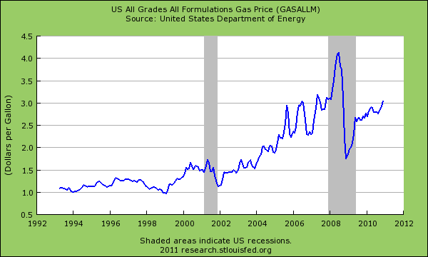
You can see the dramatic and seasonal change in energy measured by the red line. Yet housing since early 2009 has been negative for the CPI yet every other sector including food, energy, medical care, and education has been solidly above the 0 percent line. Housing being the largest component is making the entire basket look as if price growth isn�t occurring. Couple this with stagnant wages and persistently high unemployment and you can understand why it is unlikely home values will be going up anytime soon. This also doesn�t reflect the larger changes of the nation because many people have switched to renting or doubling up out of economic necessity. Lower wages or no jobs equates to less housing demand. Large vacancy rates have held rents stagnant or have dropped them in some markets. So the decline in housing values is hiding the costs of daily goods rising. Take for example the cost of a gallon of gas:
US gas prices are now trending strongly up. Here in Southern California I have seen premium going for $3.80 and we are only entering the time of year when gas goes up even higher and with global uncertainty this is likely to continue. The above graph shows that gas peaked above $4 nationally and fell to below $2 after the massive run-up in 2008. But today it is now over $3. This is a 50 percent increase from the recent trough for a good that is used weekly by all. If you only look at the CPI you would think nothing has changed. Food costs have been going up but manufactures have done a good job hiding inflation by lowering the quantity they give you for the same price:
Source: CNN
I thought I was losing my mind when my box of cereal didn�t last as long. Another important thing to mention is the tiny weighting given to medical care which is going to be a large cost for many baby boomers. Why would this weighting be so little if the demographics of the nation will be shifting to this being a large line item of consumption for many? Keep in mind many will rely on Medicare later in life so the money doesn�t necessarily come out of their pocket but someone is paying for this. Just like housing, this inflation is hidden. This is similar to the massive subsidy that is given to the housing market via artificially low rates or large tax credits via mortgage deduction. Why not cap the mortgage deduction at the median price of nationwide housing? Another item that impacts a younger generation is the incredible price rises in education. Take for example the cost of education for a public university in California:
Since income hasn�t gone up in the last decade and state funding is dwindling to institutions of higher education many more students are going to go into deeper debt for a college degree. The weighting for education is tiny on the CPI measure yet if you go to school and come out with $50,000 in debt and your first job pays you $40,000 a year, the cost of your education is going to eat a large portion of your income. You may be paying $600 in rent and $300 in repaying your debt.
Some will argue that the CPI is merely a reflection of all goods in the economy and over time offers a good measure of consumer inflation. So far for the last decade it has been a very poor measure because of the way housing is measured and its heavy weighting. The Federal Reserve will point to the CPI in support of bailing out the banks and quantitative easing. They have a point when you look at the overall basket:
Yet there is a big caveat here. Price inflation is happening ex-housing. In the early years of the bubble I argued that using the CPI to argue against a housing bubble was na�ve because it was understating the true cost of owning a home. The OER measure understated the true carrying cost of owning a home. NINJA loans allowed people with no income to buy homes that had a carrying cost of $3,000 per month! You can�t even measure that kind of weighting. Even worse, you had many folks that over leveraged and had housing eating up 70, 80, and even 90 percent of their take home pay. That is no longer the case but we are using the same CPI measure today with no adjustments.
If the main purpose of the CPI is to get a sense of the impact and feel of consumption for most Americans and it missed the entire housing bubble, then you have to question where things stand today. I�m not saying the entire measure is not worth looking at because it is but you have to be completely aware of how it is designed and what it is measuring. Right now declining home values and more importantly, weak or stagnant rents are holding nearly half the measure down covering up the cost of goods going up in other sectors. How can housing values move up with weak wages and a stagnant employment market? If you want to see what happens when real estate drags down the economy with zombie banks just look at Japan. After two decades they have muted inflation yet 1 out of 3 Japanese workers are employed in contract positions and real estate has moved nowhere but sideways for over two decades. The good news is we have already gone through one decade.
http://www.doctorhousingbubble.com/h...-college-fuel/
Comment