 Tweet
Tweet
Gives new meaning to:
GiveMake me your tired, your poor
Your huddled masses yearning to breathe free (from bankster debt)
http://economicpopulist.org/content/...-are-have-nots
Your huddled masses yearning to breathe free (from bankster debt)
http://economicpopulist.org/content/...-are-have-nots
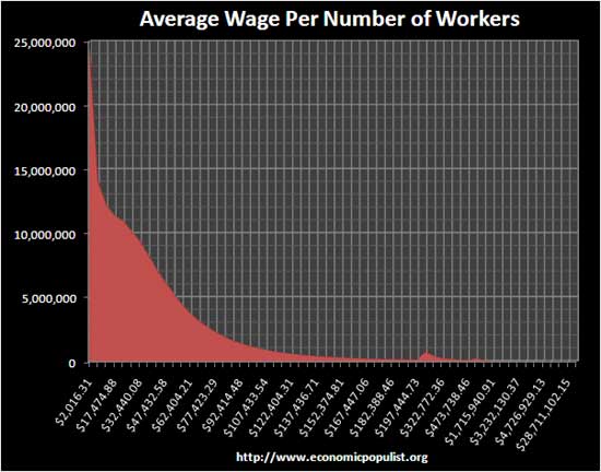
There are 150,917,735 wage earners in this country for 2009. That said, 24,315,992 of them earned less than $5000. 50% earned less than $26,261 in 2009. There are only 0.794% of wage earners who get more than $250,000 per year and only 1.266% of American salaries are over $200,000.
David Cay Johnston, the well known tax journalist, found some scary wage data.
The above graph is from this data, wage statistics for 2009. I asked Mr. Johnston for the data he used and he sent me this link. Interesting how this level of breakdown is only available from the social security administration, and not easy to find at that!
Did you know over 16% of Americans didn't even make $5000 dollars last year and in fact this group averaged $2016 for an entire year?
Here is the latest quarterly data on wage and salary accruals, from the Q3 2010 GDP release. But this aggregate data does not show the wage breakdown, so as Mr. Johnston notes, the fact most of America is poor goes right by the press and bloggers.

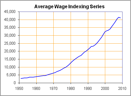
Below is a graph of the average wage index over time, not adjusted for inflation. Notice it's also misleading because it averages in those uber-rich salaries. Still, it's down 0.97% for the year and $40,934.93 is your average yearly salary in America. We're Poor in other words.
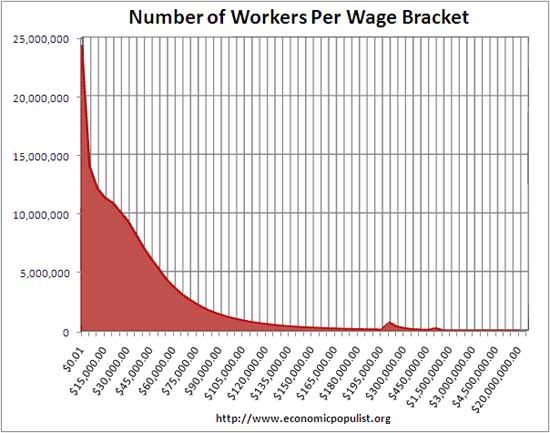
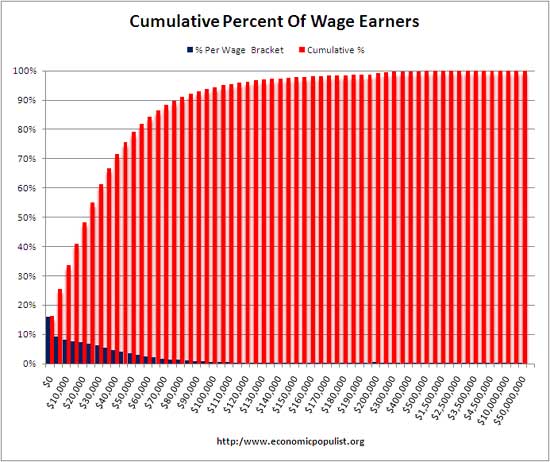
Below is the cumulative average. Notice the 50% line, it's $26,261! 90% of all Americans earn less than $80,000 per year, 99% earn less than $200,000. Think about a house payment for a $200,000 home, medical bills, retirement and higher education. I'd say the middle class isn't being destroyed, it's already been destroyed from this data.
What about the uber-rich? A very scary fact according to Johnston:
David Cay Johnston, the well known tax journalist, found some scary wage data.
Every 34th wage earner in America in 2008 went all of 2009 without earning a single dollar, new data from the Social Security Administration show. Total wages, median wages, and average wages all declined, but at the very top, salaries grew more than fivefold.
The below graph shows the average wage per bracket and the percentage of wage earners in that bracket. The above graph is from this data, wage statistics for 2009. I asked Mr. Johnston for the data he used and he sent me this link. Interesting how this level of breakdown is only available from the social security administration, and not easy to find at that!
Did you know over 16% of Americans didn't even make $5000 dollars last year and in fact this group averaged $2016 for an entire year?
Here is the latest quarterly data on wage and salary accruals, from the Q3 2010 GDP release. But this aggregate data does not show the wage breakdown, so as Mr. Johnston notes, the fact most of America is poor goes right by the press and bloggers.
Below is a graph of the average wage index over time, not adjusted for inflation. Notice it's also misleading because it averages in those uber-rich salaries. Still, it's down 0.97% for the year and $40,934.93 is your average yearly salary in America. We're Poor in other words.
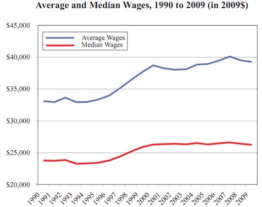
The story the numbers tell is one of a strengthening economic base with income growing fastest at the bottom until, in 1981, we made an abrupt change in tax and economic policy. Since then the base has fared poorly while huge economic gains piled up at the very top, along with much lower tax burdens.
What is a median? That is where 50% of the total workers earn less than that number and 50% earn more. The median is different from an average, which just sums up all of the wages earned and divides by the total. But that total includes the uber-rich, which skews the average wage way, way up! Since the United States has high income inequality, it's important to look at the median. What this says is 50% of Americans are living on $26,261 or less. That's poor people! That's less than $505 a week before taxes! Below is the cumulative average. Notice the 50% line, it's $26,261! 90% of all Americans earn less than $80,000 per year, 99% earn less than $200,000. Think about a house payment for a $200,000 home, medical bills, retirement and higher education. I'd say the middle class isn't being destroyed, it's already been destroyed from this data.
What about the uber-rich? A very scary fact according to Johnston:
The number of Americans making $50 million or more, the top income category in the data, fell from 131 in 2008 to 74 last year. But that�s only part of the story.
The average wage in this top category increased from $91.2 million in 2008 to an astonishing $518.8 million in 2009. That�s nearly $10 million in weekly pay!
So, 74 people had a 500% salary increase during 2009. Right. Bottom line America is poor and most statistics don't show that. Johnston also notes this all started happening with the Reagan tax cuts, proof positive supply side economics is trickle upon the middle class and you know what kind of trickle we're talkin' about. The average wage in this top category increased from $91.2 million in 2008 to an astonishing $518.8 million in 2009. That�s nearly $10 million in weekly pay!
In this era, the incomes of the vast majority have barely grown while incomes at the top have soared. Reaganism has trimmed the base of the income ladder while placing a much heavier weight on the top.
Here is Johnston's article which has more alarm bells statistics.  Even federal minimum wage of $7.25, 40 hours a week is about $15,000 a year. What are these 24 million people doing for a living?
 Part-time seasonal or other inconsistent work.

Comment