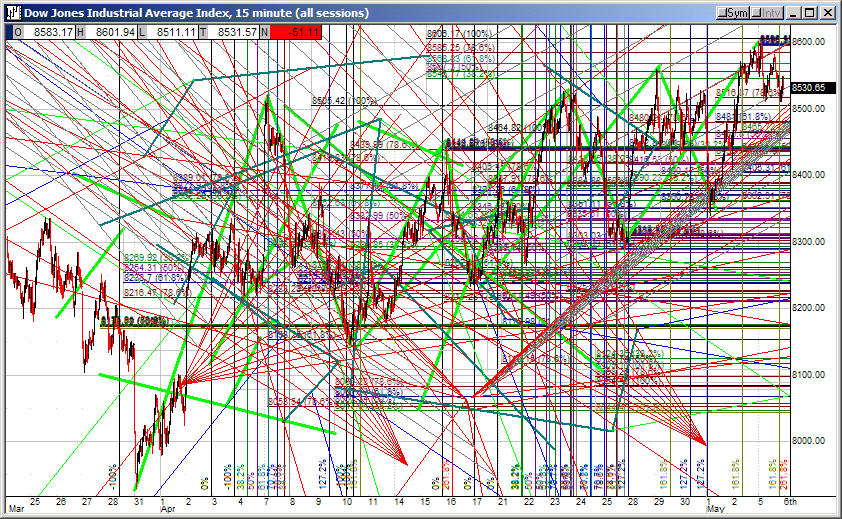
What does this chart tell you about the future? Absolutely nothing.
From early Oct. through Nov. 23 the financial media uniformly pronounced Santa Claus on strike in the North Pole. No Santa Claus rally this year. Charts were supplied to explain why Santa was sitting it out.
When markets started to rally Nov. 23 Santa Claus miraculously appeared, his presence announced as the proximate cause. No previous calls for his absence were noted for correction. Standard procedure for the financial media is to over-write previous forecasts with new ones, on the safe assumption that no one will notice or care, because entertainment not education is the primary purpose of the financial media. I'll try to do a better job of not doing that myself than I have in the past. You can't always be right in this forecasting biz, and you learn more from what you get wrong than what you get right.
Santa didn't stay long. Yesterday he abruptly left, his sled still full of investor presents. Financial market commentators, always on the hook with audiences to supply a reason for every market move decided on the yield curve as the reason for his sudden departure, this despite the fact that there's nothing happening in the yield curve that could possibly explain such a rapid and pronounced market decline.
I encourage readers to play around with this handy dynamic yield curve app. Grab the red line on the right-hand chart and slide it round recession and market correction periods.
The first thing you'll notice is that today's yield curve is hardly doing anything dramatic. It's not even flat, never mind inverted. Its' certainly flatter than at it was before short-term rate hikes began two years ago, as you'd expect, and that is one of the inputs to my forecast that the Fed is done with rate hikes for now. But keep in mind that unlike previous episodes today the long end of the curve is also managed, and the flattening is occurring along the curve relative to a much lower managed long term interest rate structure.
I don't think the market action yesterday had any more to do with the yield curve than the short-lived rally had to do with Santa Claus. More likely something went wrong somewhere in the system. We won't know what for a while what it was, although it's a safe bet that a major player in the bond market will turn out to be the culprit.
One rather peculiar feature of today's yield curve is the precisely straight slope up from the 5-year rate out to 30. Good luck finding another point in history when that happened.
As is the case with other forecasting tools that served reliably in combination with others in the past, I think we'll find that the yield curve has lost most of its utility. It may not even be a useful predictor of recessions anymore.
That won't keep market analysts from following it, thereby making it a handy tool for investor behavior modification in an era of active Asset Price Inflation.

Comment