Announcement

Collapse
No announcement yet.

August 2009 FIRE Economy Depression update – Part I: Snowball in Summer - Eric Janszen

Collapse
X
 
  • Filter
  • Time
  • Show
Clear All
new posts

  • Re: August 2009 FIRE Economy Depression update – Part I: Snowball in Summer - Eric Janszen

    Originally posted by bart View Post
    ...the fine work of John Williams (what I call CPI without lies) which shows current CPI in the +6% range.
    I Google'd "John Williams CPI" and was directed to this site. The "Alternative CPI Measures" chart on the home page don't (to me) reflect a 6% cpi... it shows 3 different CPIs, two at -2% and a Clinton era one at 1%. http://www.shadowstats.com/ Am I on the wrong site? Am I reading this incorrectly? Thanks for introducing me to him.

    Wait! I think I see now. This chart on the home page labeled "Alternative CPI Measures" aren't John William's Alternative CPI Measures. They are different goverment measures. Badly labeled. I found the 6% figure deeper in the site. The guy should put his work on his home page! Anyway, please ignore the above!

    Can someone tell me where you put charts/graphs/pictures so I can post them here? This site doesn't allow me to simply upload them....

    Oh, and Bart, to counter in advance one of your std claims... I'm not responding to every single point in your post, because I either agree with them, didn't come up with something interesting to say on them, or think that the person to who they were directed should address them... not because I'm trying to use one of the 25 rules of disinformation! I thought the rest of your post was valuable. However, this point is the one that drew my attention and on which I had something of value to contribute!
    Last edited by MarkL; August 21, 2009, 12:03 PM.

    Comment


    • Re: August 2009 FIRE Economy Depression update – Part I: Snowball in Summer - Eric Janszen

      Originally posted by MarkL View Post
      I Google'd "John Williams CPI" and was directed to this site. The "Alternative CPI Measures" chart on the home page don't (to me) reflect a 6% cpi... it shows 3 different CPIs, two at -2% and a Clinton era one at 1%. http://www.shadowstats.com/ Am I on the wrong site? Am I reading this incorrectly? Thanks for introducing me to him.

      Wait! I think I see now. This chart on the home page labeled "Alternative CPI Measures" aren't John William's Alternative CPI Measures. They are different goverment measures. Badly labeled. I found the 6% figure deeper in the site. The guy should put his work on his home page! Anyway, please ignore the above!

      Can someone tell me where you put charts/graphs/pictures so I can post them here? This site doesn't allow me to simply upload them....

      Oh, and Bart, to counter in advance one of your std claims... I'm not responding to every single point in your post, because I either agree with them, didn't come up with something interesting to say on them, or think that the person to who they were directed should address them... not because I'm trying to use one of the 25 rules of disinformation! I thought the rest of your post was valuable. However, this point is the one that drew my attention and on which I had something of value to contribute!
      Here's an answer, though FRED has one he prefers: Copy whatever picture you're interest in and put it into your computer. Opened a post window here and look down beneath it to manage attachments. There you'll have the option to upload your picture to iTulip. Once it is uploaded click on it. I believe it will be in a list of current attachments in that same window. Click the "mountain" icon = "insert image" (at the top of your Reply to Thread message window and copy the URL from the window that shows your picture, which is now on iTulips server, and paste it into the "insert image" box, and don't duplicate the "http://" If I have succeeded in describing that, then it should work.
      Attached Files
      Jim 69 y/o

      "...Texans...the lowest form of white man there is." Robert Duvall, as Al Sieber, in "Geronimo." (see "Location" for examples.)

      Dedicated to the idea that all people deserve a chance for a healthy productive life. B&M Gates Fdn.

      Good judgement comes from experience; experience comes from bad judgement. Unknown.

      Comment


      • Re: August 2009 FIRE Economy Depression update – Part I: Snowball in Summer - Eric Janszen

        tinypic is useful too

        http://tinypic.com/

        Comment


        • Re: August 2009 FIRE Economy Depression update – Part I: Snowball in Summer - Eric Janszen

          Thanks Jim, Thanks babbittd!

          Comment


          • Re: August 2009 FIRE Economy Depression update – Part I: Snowball in Summer - Eric Janszen

            I appreciate the reasoned and thorough response, Fred.

            I have actually been lurking around here for a while, reading "EJ's" posts with great interest. The charts and data are extremely interesting, and there do not seem to be many other places on the Internet where you see such intelligent discussion of economic trends.

            And while I've been very impressed with "EJ's" predictions and high-level discussion, I've become more skeptical of Ka-Poom theory, at least insofar as it predicts we'll have very high inflation in the near to medium term (I believe "EJ's" latest call is for significant inflation in this quarter or next).

            I'll try to go point by point and discuss my areas of agreement vs. areas of concern.

            First, on the issue of CPI. Yes, it has drifted upward slightly over the past couple months, but it is still well below its peak and volitile, too, as there have also been some dips in the circled portion of your first graph. And you can see from the Great Depression graph that there were some instances of rising CPI during that four-year era as well.

            I appreciate that things are not looking like the four-year CPI fall during the 1930s. The again, you're comparing this time period to the ultimate deflation spiral any big economy has ever seen. I, too, would doubt we'd see something approaching Depression-level deflation. But is that really the best/only comparison to make--at least as a direct comparison? It seems to me that's a bit like saying "look, we're not really in a severe recession because GDP is unlikely to fall as far and for as long as it did in the Great Depression." I think you'd agree that something doesn't have to be a historically severe phenomenon in order for it to qualify as a phenomenon nonetheless.

            To me, looking at those PPI figures showing 8 months of year on year price declines seems like we've qualified for at least some definition of deflation, and maybe even a deflationary spiral, though less severe than the one in the 1930s. Remember that even the deflationary spiral of the great depression came to an end.

            That brings me to the next couple graphs regarding PPI and CPI and CPI vs. energy costs. First, I would never dispute the tight relationship between energy and costs, but what I take from your two-part definition of Ka-Poom is that it posits an inflationary force indepedent from energy costs. So while I completely agree that higher energy costs mean higher prices for goods, that's a distinct inflationary phenomenon from fiscal and monetary actions from the federal government, which I understand Ka-Poom to concern.

            But I do see that PPI/CPI graph shows that all components of PPI along with CPI are on the downtrend now and have been for several months, albeit with some volatility. And all of that downtrend has happened in the face of 0% fed funds rate and $300 billion (at least) in quantitative easing. That should mean something, right? To me, it suggests that high inflation may be further off than we think.

            Consider also that the Fed's primary means of "printing money" is through the fed funds rate which does not directly enter the economy but instead goes through the intermediary of the banks. If a bank's balance sheet is alright, that money gets spun out into the economy through debt, which leads to inflation if too much money is "printed." I think that's what we saw after the 2001 recession with the housing bubble, etc.

            But what if, like Japan in the 1990s, the banks' balance sheets are in so much tatters that they effectively hoard the fed's money? It seems to me that it becomes far more likely that you'll see something different--something that looks like deflation or like Japan. Something, perhaps, that looks like what we're seeing today with falling PPI and CPI.

            Another thing about that CPI and PPI chart that jumps out at me: at no time since 1990 have prices fallen for any significant time period--at least at no time before now. We're seeing the CPI at a level we last saw in early 2008, a year and a half ago. The graph shows no deflation event even close to approaching this one for nearly 20 years. It seems to me that should carry some significance and suggest that maybe this recession might be different from others vis a vis inflation.

            And I have to say, I still don't get your response to the Target example. You say retailers can't sell a good less than it costs. True, but retailers' costs themselves are not fixed. Just like Target can lower the price for me, Target's suppliers can lower the costs for them, and Target has many suppliers who compete to provide goods to Target. Why wouldn't Target's suppliers likewise lower their prices? That's certainly what classic supply and demand would suggest: that for ANY market, including the wholesale market, lower demand equals lower prices all other things being equal. That should be true for Target's costs, too. And since PPI is flat to falling for all classes of goods, Target's suppliers should be able to lower their prices to compete for Target's business.

            And it's not just the price of goods that are falling. Labor costs for Target and everyone else are plummetting because businesses are laying people off and cutting their hours, so that, too, should aid in both retailers and wholesalers being able to cut costs.

            You say costs have not been cut dramatically by comparing oil today to oil in 2001. True, oil is a lot more expensive than a decade ago. But I don't think you have to have prices that look a decade old to qualify as deflation. Prices just have to be going lower, and there's no dispute that producers are paying quite a lot less for everything than they were a year ago. That would suggest that they have some significant room to keep prices flat to lower vs the prices we're paying today, and that they should be able to for some time to come, not just in the first half of this year.

            As to Bart's graph about the money supply increasing so much since September 2008, I actually find that to be one of the biggest reasons I'm skeptical of looming high inflation. As bart's chart shows, the Fed cranked the presses big time for the last ten months. But it didn't work! You'd think, if the Fed's printing press were as powerful as it has been in past recessions, we'd have an explosion of inflation. Instead, both CPI and PPI are significantly lower today than they were when they turned the presses to overtime.

            That suggests to me that this time may well and truly be different, and that the fed's ability to create inflation has been severely hampered by zombie banks that are gobbling up the money to feed their distressed balance sheets and to replace all the money that burned when the financial crisis hit.

            Will it be different forever? Of course not. Everything changes over time. The deflation of the Great Depression came to an end, as did the inflation of the 70s. But at least for now, it looks like the banks' excesses, and their excessive losses, are seriously styming the fed's effort to reflate.

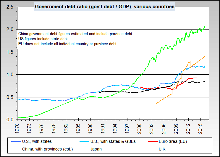
            As for the fact that we're a debtor nation, I've been thinking about that, and what long-term effect that might have. This post is getting long, so I'll save that for another day, but I will at least point out the following: several Western European nations have higher debt to GDP ratios than we do. And yet, they haven't seen rampant inflation and defaults. Doesn't that suggest that we may have more wiggle room than we think with our debts? Not that I think it's a healthy long-term position to be in, mind you, but it's an interesting comparison, I think.

            Comment


            • Re: August 2009 FIRE Economy Depression update – Part I: Snowball in Summer - Eric Janszen

              You are right, bart. I meant 0.012 OR 1.2%. My mistake.

              I don't, however, think it adds much to then turn that to an annualized rate. Yes, PPI is up 1.2% over five months. But it's also down 0.9% from last month. Why not annualize that -.9% number? I'm sure each of us could find some stretch of time that helps our cause, be it year on year and month on month for me, or for a five month period for you.

              As for John Williams and shadowstats, the graphs on the home page show a precipitous fall in the rate of inflation for all three measures, and deflation for two of them. That seems generally to support what I've been saying, which is that the numbers do not seem to suggest serious inflation from today's prices any time soon.

              In any event, I'm generally sticking with PPI because it's readily available, known by all, and has been more or less approved as a decent measuring stick for prices by "EJ," as I noted in a prior post.

              I still think it odd that you deem any dissenting opinion to yours to be "misinformation" and use of any other metric than your preferred metrics misleading or not worthy of consideration. I do sincerely hope that we can raise our level of dialogue and that you will, at some point, come to the realization that someone with a different opinion than yours does not automatically qualify as an enemy.

              Comment


              • Re: August 2009 FIRE Economy Depression update – Part I: Snowball in Summer - Eric Janszen

                I agree that oil is historically high, and that if it gets higher, prices go higher. And, of course, if energy spikes again, we'll certainly have inflation.

                But I'm focusing my comments on the Ka-Poom theory, which is focused not on inflation arising purely from higher energy costs, but essentially from fiscal and monetary actions by the federal government.

                And actually, a big part of my skepticism about non-energy-related inflation is that we are in the worst recession in two generations. That means demand is way way down, and lower demand means lower prices, all other things equal.

                I know "Peak Cheap Oil" has been discussed on this site, so I don't mean to suggest energy inflation has been ignored by iTulip. And I think probably all of us would agree that's a potential source of serious inflation in the long run. I also know that a debauched dollar would lead to higher oil prices, but that would show up in the relative cost of oil in dollars vs. other currencies (actually, it would most likely show up in a greatly weakened dollar vs. other currencies given that most oil is purchased in dollars). But we haven't seen that yet, as the dollar index is flat to higher today vs. a year ago.

                Hopefully that gives some context to some of my comments.
                Last edited by rdrees; August 21, 2009, 02:12 PM.

                Comment


                • Re: August 2009 FIRE Economy Depression update – Part I: Snowball in Summer - Eric Janszen

                  Originally posted by rdrees View Post
                  As for the fact that we're a debtor nation, I've been thinking about that, and what long-term effect that might have. This post is getting long, so I'll save that for another day, but I will at least point out the following: several Western European nations have higher debt to GDP ratios than we do. And yet, they haven't seen rampant inflation and defaults. Doesn't that suggest that we may have more wiggle room than we think with our debts? Not that I think it's a healthy long-term position to be in, mind you, but it's an interesting comparison, I think.
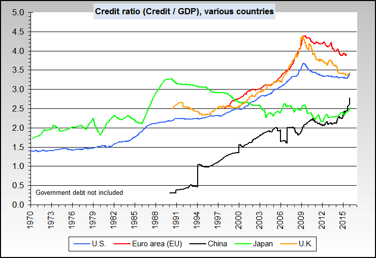
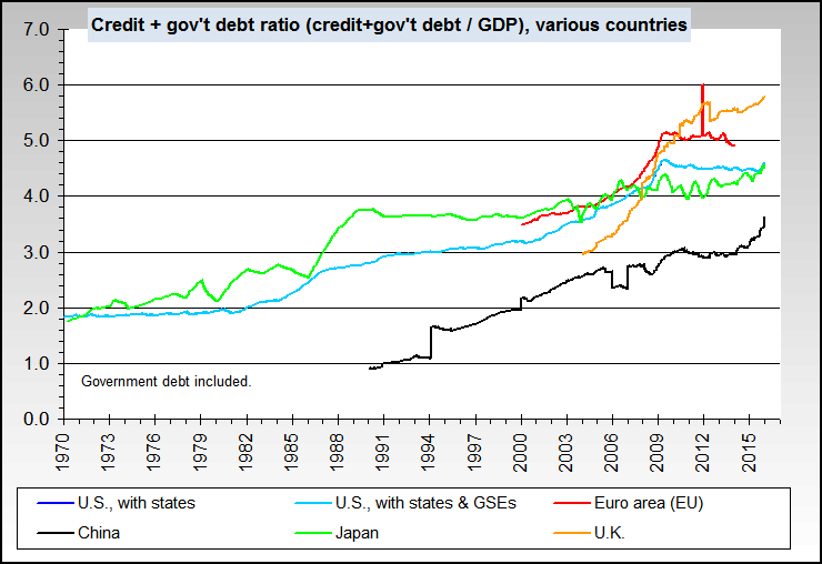
                  When you state "several Western European nations have higher debt to GDP ratios than we do", that may be true for governmental debt to GDP ratios. But what if you add in consumer debt, financial debt, corporate debt, and (if it wasn't already included) state, county, and city debt?

                  In addition our "official" Federal debt doesn't include what's owed by the government to the people like SS and Medicare as these are labeled "entitlements", doesn't include the high-risk-of-of-default mortgages that Fannie and Freddie are likely to go bankrupt on, and doesn't include some of the high-risk CDRs/CDSs that the Federal Reserve is taking on.

                  Are you sure that "several Western European nations have higher debt to GDP ratios than we do" when all debt is summed and compared to GDP?

                  Comment


                  • Re: August 2009 FIRE Economy Depression update – Part I: Snowball in Summer - Eric Janszen

                    I doubt I'll be able to provide you with a statistic that could encompass all of those concerns at once, but among the broadest, perhaps, is external debt to GDP, with external debt defined as "the total public and private debt owed to nonresidents repayable in foreign currency, goods, or services."

                    http://en.wikipedia.org/wiki/List_of..._external_debt

                    We are at 95%. That's much higher than most countries, as we have the 24th highest ratio out of 202 countries. However, Switzerland, the UK, the Netherlands, France, Germany, Denmark, Norway, Finland, and Australia all have higher ratios than us. Some are way higher--France, for example, is at 212%

                    Another metric focuses on total public, i.e. government debt, to GDP.

                    http://en.wikipedia.org/wiki/List_of...by_public_debt

                    We're at 61%, which is 28th highest in the world. Then again, Japan, Norway, Germany, Italy, Canada, and France are all above us. France, for example, is at 64%.

                    So by either metric, a decent number of Westernized economies exceed our debt positions vs. GDP. Yet none of them has had defaults or out of control inflation.

                    You also asked about entitlements--well, I'm not sure how to add that up to compare to other countries, but I would be shocked if our level of entitlements were anything close to Western Europe's.

                    So if France hasn't defaulted and the Euro hasn't tanked, why should we expect those results out of the dollar when it would appear that our debt position is relatively better?

                    Not good, mind you. I don't like our fiscal position at all in the long term. But we should start to see where the breaking point comes in other big Western economies before we see it in ours, it would seem.

                    Comment


                    • Re: August 2009 FIRE Economy Depression update – Part I: Snowball in Summer - Eric Janszen


                      http://www.NowAndTheFuture.com

                      Comment


                      • Re: August 2009 FIRE Economy Depression update – Part I: Snowball in Summer - Eric Janszen

                        Originally posted by rdrees View Post
                        I appreciate the reasoned and thorough response, Fred.

                        I have actually been lurking around here for a while, reading "EJ's" posts with great interest. The charts and data are extremely interesting, and there do not seem to be many other places on the Internet where you see such intelligent discussion of economic trends.

                        And while I've been very impressed with "EJ's" predictions and high-level discussion, I've become more skeptical of Ka-Poom theory, at least insofar as it predicts we'll have very high inflation in the near to medium term (I believe "EJ's" latest call is for significant inflation in this quarter or next).

                        I'll try to go point by point and discuss my areas of agreement vs. areas of concern.

                        First, on the issue of CPI. Yes, it has drifted upward slightly over the past couple months, but it is still well below its peak and volitile, too, as there have also been some dips in the circled portion of your first graph. And you can see from the Great Depression graph that there were some instances of rising CPI during that four-year era as well.
                        Actually, no. During the entire 48 month decline in CPI from 1930 to 1934 there was never more than one month when CPI increased month over month and never year over year.


                        This time around, CPI and energy have been rising continuously for several quarters.


                        It's case closed on the deflation spiral. Why? Because double entry bookkeeping works better when you don't have to balance entries on one side of the balance sheet with physical gold on the other. The determination to do that in the early 1930s is the reason the U.S. and only the U.S. experienced a deflation spiral. No other country did. See The truth about deflation. Deflationists such as Mike Shedlock don't want to talk about this for fear of alienating the goldbug readership that's attracted to the banker bashing rhetoric. But facts are facts. Sans gold standard, a central bank can, in the famous words of Alan Greenspan in 2003, "Theoretically expand its balance sheet infinitely." We never forgot that line. It turned out to be prophetic.

                        Even if prices did begin to fall again, we trust the Fed to expand its balance sheet even more. The principle of buying assets with government money has extended beyond the FIRE Economy. The government is willing to print money and buy cars, and now print money to buy appliances. Why not buy commercial real estate? Houses? Whatever it takes to support prices. Why not? Who a year ago would have imagined "Cash for Clunkers"? Sometimes I think the difficultly with the deflationist mindset is a lack of imagination. Betting against this principle of government using its balance sheet to substitute public for private credit and money has been a losing proposition for over 10 years.

                        I appreciate that things are not looking like the four-year CPI fall during the 1930s. The again, you're comparing this time period to the ultimate deflation spiral any big economy has ever seen. I, too, would doubt we'd see something approaching Depression-level deflation. But is that really the best/only comparison to make--at least as a direct comparison? It seems to me that's a bit like saying "look, we're not really in a severe recession because GDP is unlikely to fall as far and for as long as it did in the Great Depression." I think you'd agree that something doesn't have to be a historically severe phenomenon in order for it to qualify as a phenomenon nonetheless.

                        To me, looking at those PPI figures showing 8 months of year on year price declines seems like we've qualified for at least some definition of deflation, and maybe even a deflationary spiral, though less severe than the one in the 1930s. Remember that even the deflationary spiral of the great depression came to an end.
                        We have over the years had to address both scenarios, the deflation spiral case and the Japan since 1993 stag-deflation case. The deflation spiral case is closed. Anyone who brings it up again will be directed to various articles here that explain why.

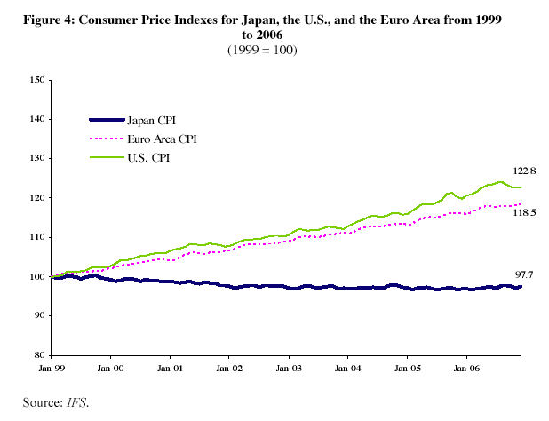
                        That still leaves the Japan case. The deflation there is clearly not a self-reinforcing spiral. From 1999 to 2008, the Japan CPI drifted down 2.3%.


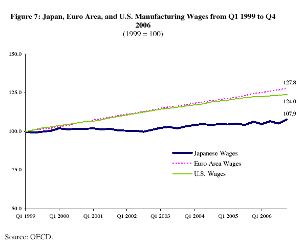
                        That kind of deflation is more like the kind the GavKal talks about, the good kind that increases the purchasing power of income. In fact, whie consumer prices 2.3% fell in Japan, wages went up by nearly 8%!


                        Now, neoclassical models tell us that's not possible. The whole matter of a generation of brainwashed economists is too big in scope to go into here, but suffice it to say when we see employment in the IT field in Silicon Valley fall 26% from 2001 to 2008 while wages increased 69%, the theory of NAIRU has problems. When we crack open NAIRU we find the thick, gooey, ideological filling: the relationship between prices and wages has been oversimplified for political convenience.

                        But I digress. If the U.S. were able to manage a "deflation" as Japan has experienced since 1993, that would not be such a bad thing. For that we'd first need to generate a current account surplus to offset a capital account deficit. Since our economy is structured around a current account deficit and depends on a capital account surplus to finance employment, such restructuring will require a major transformation in labor markets and investment that will take ten years or more. In the mean time, the value of the dollar drifts down and down, as it has since 2001 except for the period of deleveraging when the world ran for dollars to unwind leveraged bets.

                        That brings me to the next couple graphs regarding PPI and CPI and CPI vs. energy costs. First, I would never dispute the tight relationship between energy and costs, but what I take from your two-part definition of Ka-Poom is that it posits an inflationary force indepedent from energy costs.
                        You misunderstand the theory. There are two major sources of inflation and many minor ones that lead to our theory that we will experience a rising in inflation no later than Q1 2010. These are detailed in Everyone is wrong, again – 1981 in Reverse Part II: Nine Signs of Inflation. The two major sources are cost push from energy imports and a reduction in price competition among producers due to bankruptcies and consolidation. Rising energy costs are inflationary.
                        So while I completely agree that higher energy costs mean higher prices for goods, that's a distinct inflationary phenomenon from fiscal and monetary actions from the federal government, which I understand Ka-Poom to concern.
                        Disagree. A weak dollar is the primary reason for high energy costs. Monetary and fiscal policy are the primary reasons for dollar weakness. Thus high energy costs are a result of monetary and fiscal policy.

                        But I do see that PPI/CPI graph shows that all components of PPI along with CPI are on the downtrend now and have been for several months, albeit with some volatility. And all of that downtrend has happened in the face of 0% fed funds rate and $300 billion (at least) in quantitative easing. That should mean something, right? To me, it suggests that high inflation may be further off than we think.
                        Are we both looking at the same graph? Both the PPI and CPI have risen for six months straight until July. The volatility is there, but in the other direction from the one you see. The trend is clearly inflation with an occasional one month dip, not deflation with an occasional one month rise. In fact, we expect the sharp rise in inflation in June was due to seasonal factors. June and July summed average to the trend that started in early 2009.


                        If you take the year over year view, you can create a graph that looks like deflation.


                        But if you look carefully you can see that PPI and CPI have gone from 45% year over year to -40% year over year over the course of one year. +45% + -40% = +5%, an increase not a decline. Any way you cut it, PPI and CPI are rising.

                        Consider also that the Fed's primary means of "printing money" is through the fed funds rate which does not directly enter the economy but instead goes through the intermediary of the banks. If a bank's balance sheet is alright, that money gets spun out into the economy through debt, which leads to inflation if too much money is "printed." I think that's what we saw after the 2001 recession with the housing bubble, etc.
                        That is not how money is created to finance cash flows in a modern hybrid fiat and endogenous money system. Money is lent into being by the act of borrowing. If households and businesses aren't doing it, the government will do it for them, and has. This is a philosophical point that deflationists disagree with.

                        But what if, like Japan in the 1990s, the banks' balance sheets are in so much tatters that they effectively hoard the fed's money? It seems to me that it becomes far more likely that you'll see something different--something that looks like deflation or like Japan. Something, perhaps, that looks like what we're seeing today with falling PPI and CPI.
                        The CPI and the PPI are clearly rising as you can see in the charts above.

                        The U.S. cannot experience deflation ala Japan unless the U.S. can export 20% of the world's capital flows instead of importing 40% of them. Who shall we export to? From what industries? With what workers?

                        Another thing about that CPI and PPI chart that jumps out at me: at no time since 1990 have prices fallen for any significant time period--at least at no time before now. We're seeing the CPI at a level we last saw in early 2008, a year and a half ago. The graph shows no deflation event even close to approaching this one for nearly 20 years. It seems to me that should carry some significance and suggest that maybe this recession might be different from others vis a vis inflation.
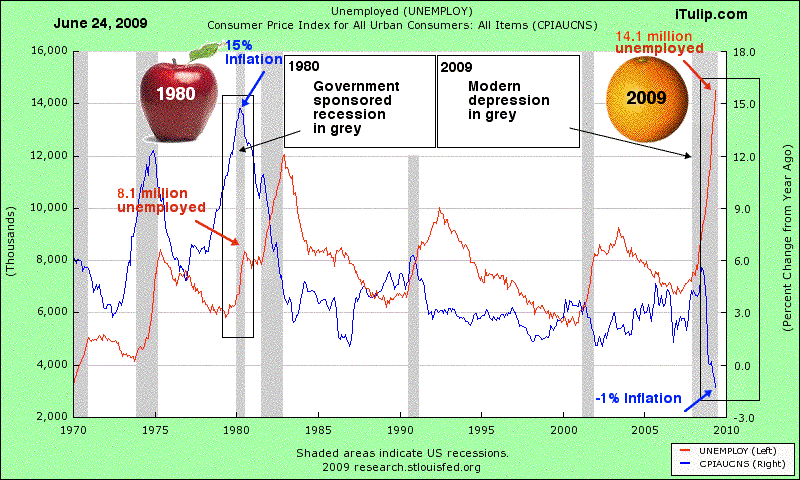
                        No doubt this one is different! Here's the chart we show to spell it out.


                        This depression was not created on purpose by the Fed off a CPI at 15%. The Fed is busy building a foundation for inflation, not destroying an old one. They think they are stopping a second Great Depression. When the history books are written, it will be noted that the Fed did not understand the unique risk that the U.S. as a net debtor faces in 2009 that it did not face in 1930 when the U.S. was a net creditor and devalued the dollar by 70%. Devaluation by fiscal deficit spending is a dangerous policy.

                        And I have to say, I still don't get your response to the Target example.
                        You say retailers can't sell a good less than it costs. True, but retailers' costs themselves are not fixed. Just like Target can lower the price for me, Target's suppliers can lower the costs for them, and Target has many suppliers who compete to provide goods to Target. Why wouldn't Target's suppliers likewise lower their prices?
                        That's precisely the point: they can't. Where are they going to get oil for less than $70 a barrel? Look at the PPI again.

                        That's certainly what classic supply and demand would suggest: that for ANY market, including the wholesale market, lower demand equals lower prices all other things being equal.
                        But all other things aren't equal. The dollar has been devalued. Oil is $72 not $16 as in 2001.

                        That should be true for Target's costs, too. And since PPI is flat to falling for all classes of goods, Target's suppliers should be able to lower their prices to compete for Target's business.
                        The PPI is rising for all classes of goods.

                        And it's not just the price of goods that are falling. Labor costs for Target and everyone else are plummetting because businesses are laying people off and cutting their hours, so that, too, should aid in both retailers and wholesalers being able to cut costs.
                        Oh, really? We've been trying to tell you: we're not in Kansas anymore.


                        What? Unit labor costs shot up during the FIRE Economy Depression?

                        You say costs have not been cut dramatically by comparing oil today to oil in 2001. True, oil is a lot more expensive than a decade ago. But I don't think you have to have prices that look a decade old to qualify as deflation. Prices just have to be going lower, and there's no dispute that producers are paying quite a lot less for everything than they were a year ago. That would suggest that they have some significant room to keep prices flat to lower vs the prices we're paying today, and that they should be able to for some time to come, not just in the first half of this year.
                        No, prices just have to go higher, and they have.

                        As to Bart's graph about the money supply increasing so much since September 2008, I actually find that to be one of the biggest reasons I'm skeptical of looming high inflation. As bart's chart shows, the Fed cranked the presses big time for the last ten months. But it didn't work! You'd think, if the Fed's printing press were as powerful as it has been in past recessions, we'd have an explosion of inflation. Instead, both CPI and PPI are significantly lower today than they were when they turned the presses to overtime.
                        Again, PPI and CPI are higher, not lower.

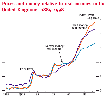
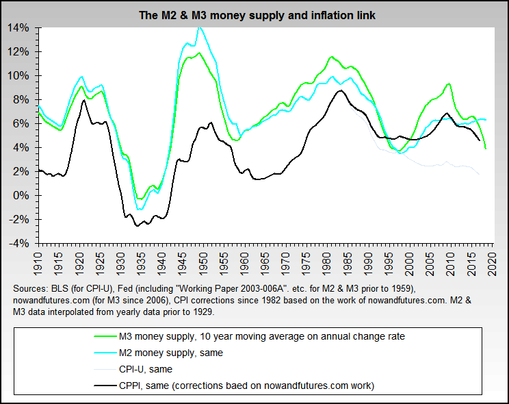
                        The relationship between the money supply and inflation, with time lags, hard to dispute.


                        That suggests to me that this time may well and truly be different, and that the fed's ability to create inflation has been severely hampered by zombie banks that are gobbling up the money to feed their distressed balance sheets and to replace all the money that burned when the financial crisis hit.
                        take the extreme case, Argentina. In 2002, virtually no credit. A cash economy. Banking system? Dead. Inflation? Over 20%.

                        Will it be different forever? Of course not. Everything changes over time. The deflation of the Great Depression came to an end, as did the inflation of the 70s. But at least for now, it looks like the banks' excesses, and their excessive losses, are seriously styming the fed's effort to reflate.
                        Yes, but why did the Depression era deflation end? The Fed took the U.S. off the gold standard and devalued the dollar 70%. Why did the 1970s inflation end? The Fed raised short term interest rates to 18%. What will result from QE, massive money growth, zero interst rates, a depreciating dollar and a 12.3% FY2009 fiscal deficit? Not deflation.

                        As for the fact that we're a debtor nation, I've been thinking about that, and what long-term effect that might have. This post is getting long, so I'll save that for another day, but I will at least point out the following: several Western European nations have higher debt to GDP ratios than we do. And yet, they haven't seen rampant inflation and defaults. Doesn't that suggest that we may have more wiggle room than we think with our debts? Not that I think it's a healthy long-term position to be in, mind you, but it's an interesting comparison, I think.
                        They have no external debt. They owe the money "to themselves." Foreigners not only hold our debt but we have to keep borrowing from them to repay the debt we owe them and also finance the operations of our government.

                        Good discussion.
                        Last edited by FRED; August 21, 2009, 03:31 PM.
                        Ed.

                        Comment


                        • Re: August 2009 FIRE Economy Depression update – Part I: Snowball in Summer - Eric Janszen

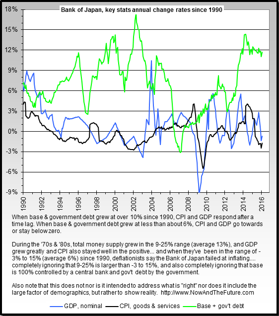
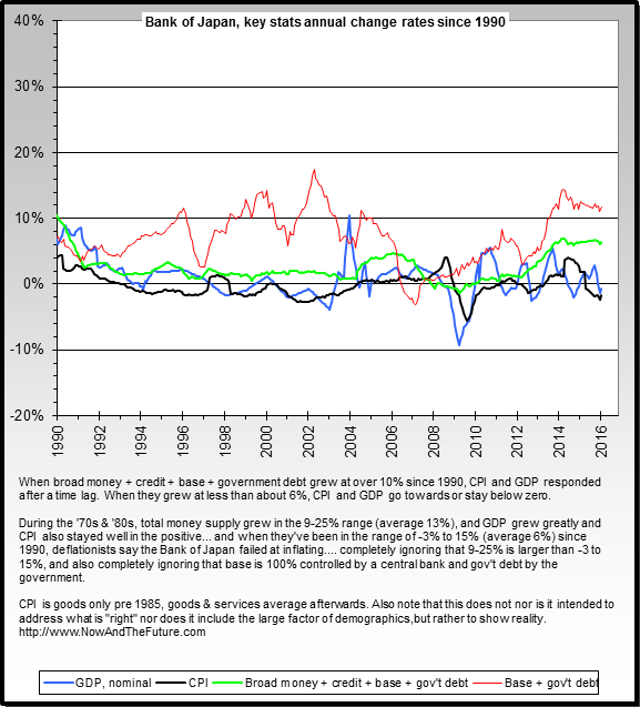
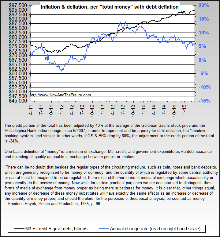
                          And another view on Japan and its experiences (and one with which deflationists like Mike Shedlock can't deal).


                          And here's yet another set with which inflationists can't deal.


                          http://www.NowAndTheFuture.com

                          Comment


                          • Re: August 2009 FIRE Economy Depression update – Part I: Snowball in Summer - Eric Janszen

                            Thank you for the charts, bart.

                            I think these would indeed suggest that we are around the middle of the pack compared with other countries on a number of debt/GDP ratios. While we look a bit worse off when it comes to our government debt ratio, note from my prior post that Europe's three largest economies, France, Germany, and Italy, are all worse than us, although it would appear that the rest of the European countries' houses are in good order on that account, pushing the EU average down below ours.

                            Comment


                            • Re: August 2009 FIRE Economy Depression update – Part I: Snowball in Summer - Eric Janszen

                              The root of the PPI/CPI portion of this discussion is simply timing. Both trendlines can be extrapolated from the data. I've heard it said that technical analysis (charts) shows which way the wind is blowing... but not whether a storm is coming in.


                              I personally am invested for inflation as per EJ's recommendation. I hope the blue trendline holds up!

                              This is the first time I've uploaded an image! Thanks to the Jim and babbittd who taught me how.
                              Attached Files
                              Last edited by MarkL; August 21, 2009, 04:29 PM.

                              Comment


                              • Re: August 2009 FIRE Economy Depression update – Part I: Snowball in Summer - Eric Janszen

                                Very interesting thoughts. MarkL's graph probably shows one of Fred and my biggest disconnects, as we're looking at the same numbers but with different timelines for different conclusions.

                                But first, can someone teach me how to do that sort of embedded/quote reply thing? I think that would make a response easier to read and follow.

                                Oh, and I may not be able to respond until over the weekend, but I will get to it.

                                Comment

                                Working...
                                X